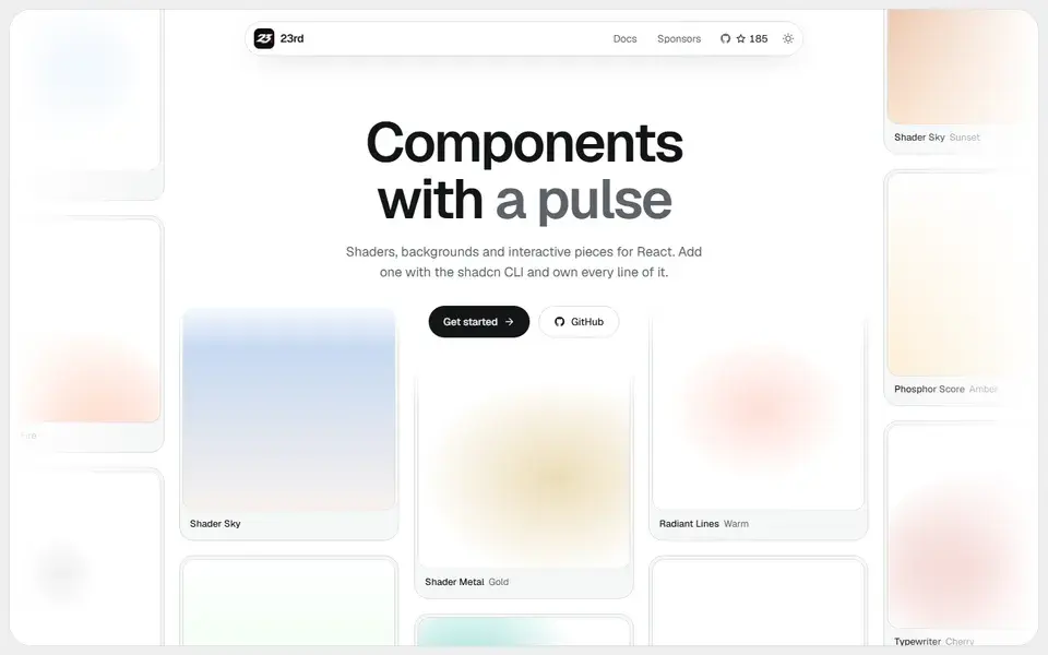
A shadcn/ui registry of opinionated React components, from WebGL shaders and animated backgrounds to footers, 404 pages and a gooey colour picker, installed by CLI so you own the code.
components
 23rd.dev

neaticons.com
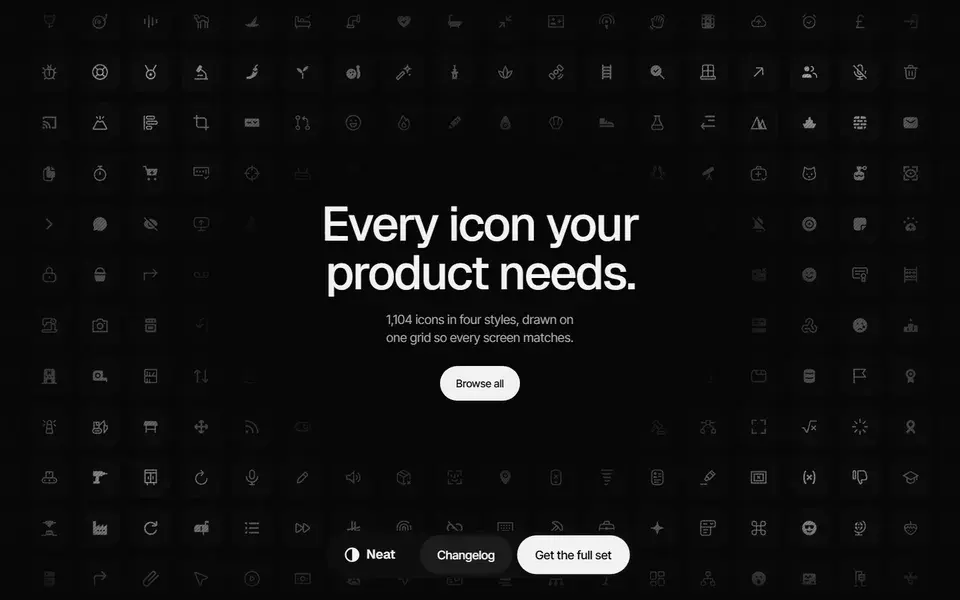
A 1,104-icon set drawn on one 24px grid in Rounded and Sharp plus Line and Solid, shipped as Figma component sets, SVG files and a typed React package.
Neat Icons ships 1,104 icons on a single 24px grid across four styles: Rounded, Sharp, Line and Solid. The download includes a Figma file where every icon is a component set, plus SVG files for each style. 200 icons are free for personal and commercial projects, while the full set, Figma file and MCP server come with the Personal and Team plans.
The @neaticons/react package exposes each icon as a typed, tree-shakable component of roughly 1.6 KB with size, color, strokeWidth and title props, any SVG prop and a ref. The set also covers Riyal and dirham symbols, a hijri calendar and RTL icons, and the changelog lists animated icons and duotone/twotone styles as in progress.
A shadcn/ui registry of opinionated React components, from WebGL shaders and animated backgrounds to footers, 404 pages and a gooey colour picker, installed by CLI so you own the code.
23rd.dev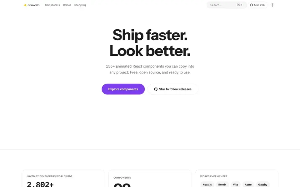
About 130 hand-crafted animated React components built with Tailwind CSS v4 — text effects, backgrounds, cards, widgets and bento grids — installed with the shadcn CLI.
Animate UI replaces shadcn/ui primitives with animated versions built on Radix UI, Base UI and React Aria, driven by Motion.