 Featured
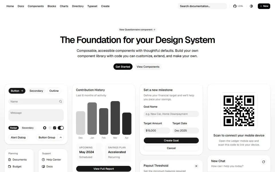
Beautifully designed components that you can copy and paste into your apps. Accessible, customizable and open source — built on Radix UI and Tailwind CSS.
ReactTailwindComponents+2
 ui.shadcn.com
Explore UI libraries, design inspiration, creative websites and practical tools for your next web project.
Eight buckets, zero clutter — the fine-grained details live in tags.
Reusable UI components and interface kits for modern web apps.
Interface patterns and product design references.
Creative websites, landing pages and digital experiences.
AI tools for UI generation, design assistance and frontend work.
Tools for interface design, prototyping and frontend workflows.
Animation libraries, micro-interactions and visual effects.
Icons, fonts, backgrounds and visual assets.
Practical design guides, design systems and learning resources.
Short, opinionated starting points for the most common stacks.
Copy-paste primitives, animated effects and full kits — and how to pick between them.
The framework plus Tailwind-native components, icons and tooling.
UI generators, AI code editors and design assistants, separated by workflow.
Ownership, accessibility and maintenance — how to choose a component library.
Product screens, flows and galleries, matched to the decision you are making.
License, formats and consistency before an icon or font set reaches production.
Editor-selected resources worth your next bookmark.
FeaturedBeautifully designed components that you can copy and paste into your apps. Accessible, customizable and open source — built on Radix UI and Tailwind CSS.
ui.shadcn.com Featured
150+ animated components built with React, Tailwind CSS and Motion. Copy-paste landing page sections and effects that make marketing sites stand out.
 magicui.design
 Featured
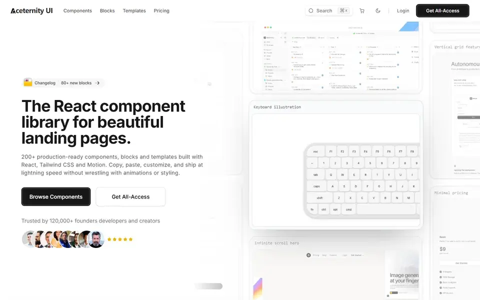
Stunning animated components and effects built with Next.js, Tailwind CSS and Framer Motion. A go-to source for hero sections with visual punch.
 ui.aceternity.com
 Featured
A curated library of real-world mobile and web app screenshots — onboarding flows, paywalls and UI patterns from hundreds of production products.
 mobbin.com
 Featured
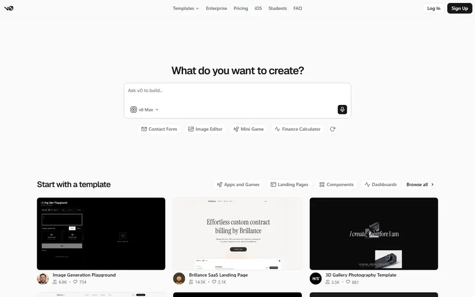
Vercel's AI-powered generative UI tool — prompt in, production-ready React and Tailwind code out. The fastest way from idea to interface.
 v0.dev
The newest additions to the collection.
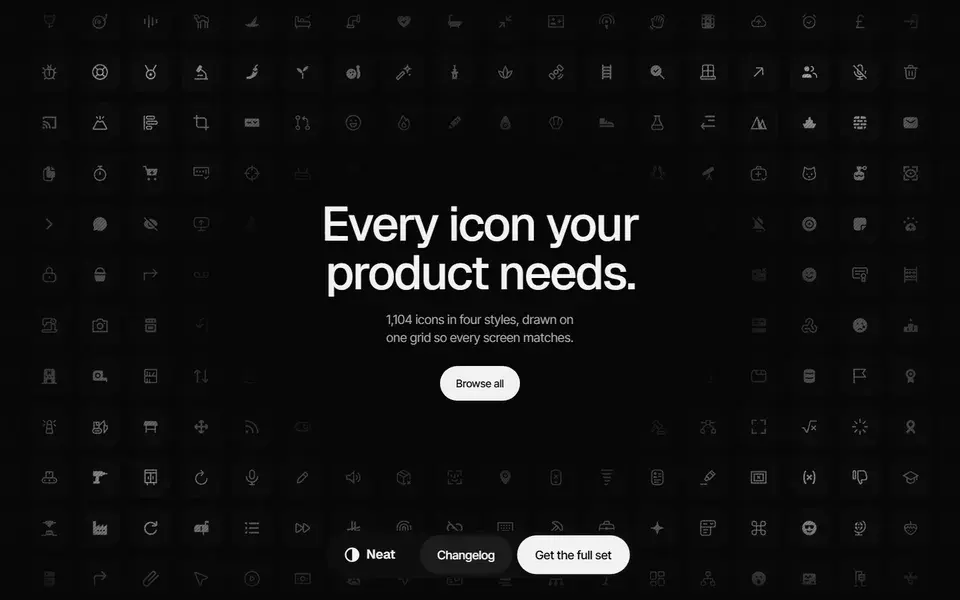
A 1,104-icon set drawn on one 24px grid in Rounded and Sharp plus Line and Solid, shipped as Figma component sets, SVG files and a typed React package.
 neaticons.com
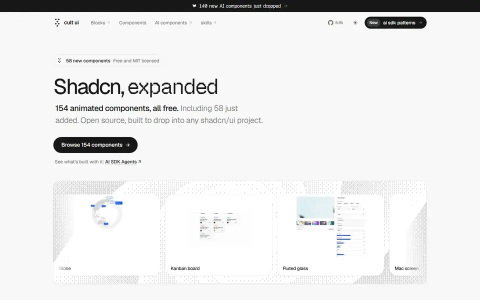
154 free, MIT-licensed animated shadcn/ui components and blocks, from a globe and kanban board to Apple device mockups, installed by copy-paste or one CLI line.
 cult-ui.com
65 React components, 9 hooks and 5 utilities built on Base UI and Tailwind CSS v4, added through the shadcn CLI so the source lands in your project under MIT.
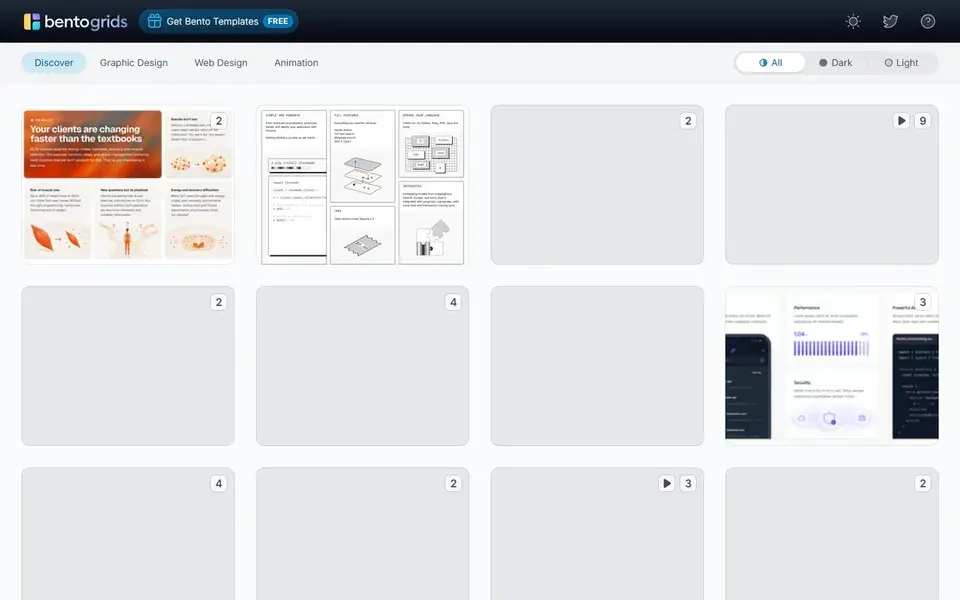
A curated gallery of bento-grid layouts from real product sites, with each entry linking back to the live page it was taken from.
 bentogrids.com
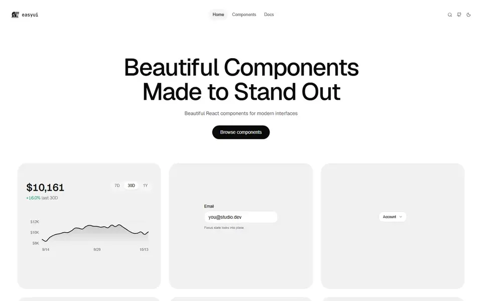
An open-source set of 131 micro-animated React components distributed through the shadcn GitHub registry, using spring physics and copy-paste source ownership.
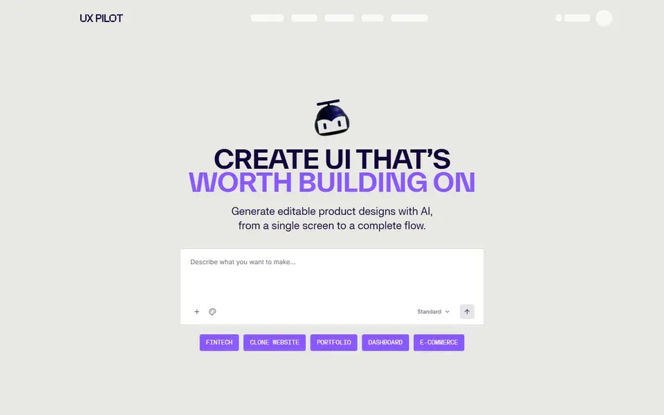
An AI design tool that turns sketches, screenshots or PRD text into editable wireframes, high-fidelity screens and full UX flows, with Figma and GitHub export.
 uxpilot.ai
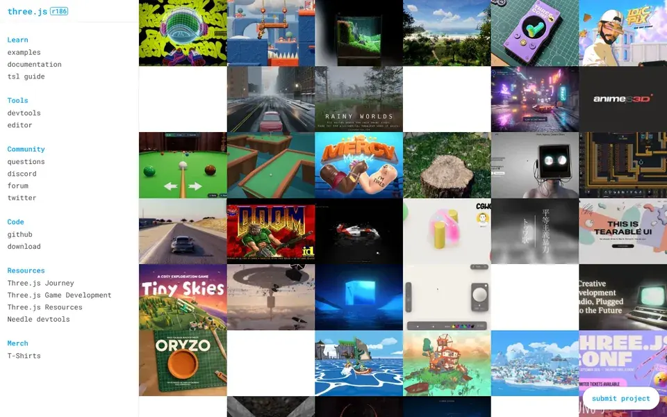
A general-purpose JavaScript 3D library with WebGL and WebGPU renderers plus SVG and CSS3D addons, used for real-time scenes that run in the browser.
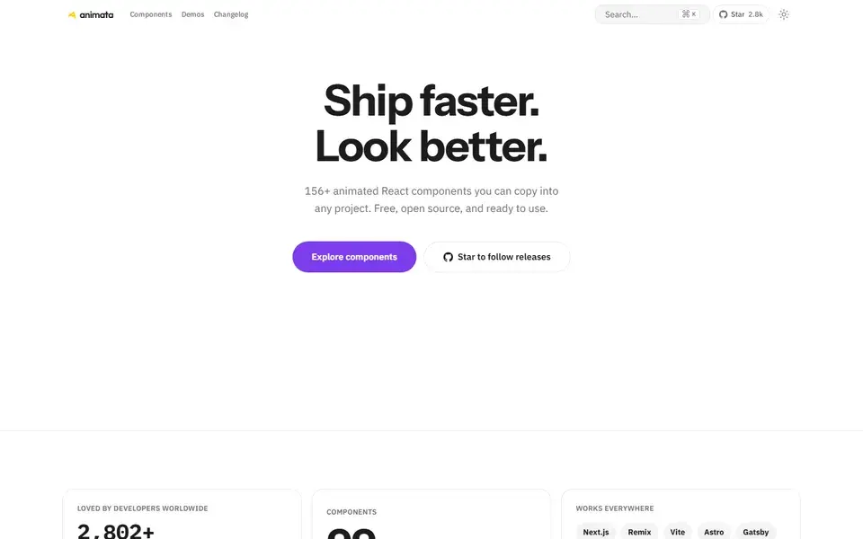
About 130 hand-crafted animated React components built with Tailwind CSS v4 — text effects, backgrounds, cards, widgets and bento grids — installed with the shadcn CLI.