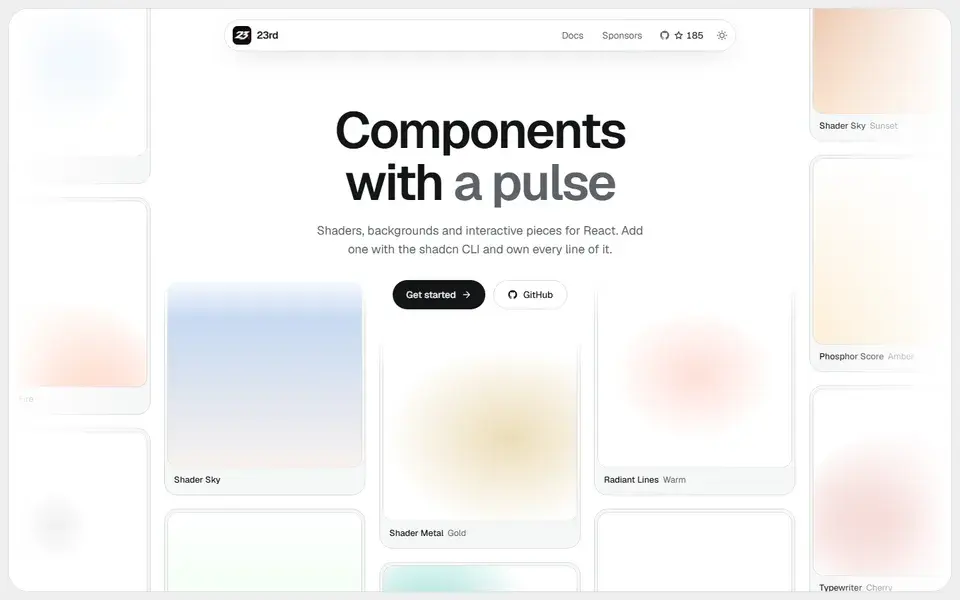
A shadcn/ui registry of opinionated React components, from WebGL shaders and animated backgrounds to footers, 404 pages and a gooey colour picker, installed by CLI so you own the code.
components
 23rd.dev
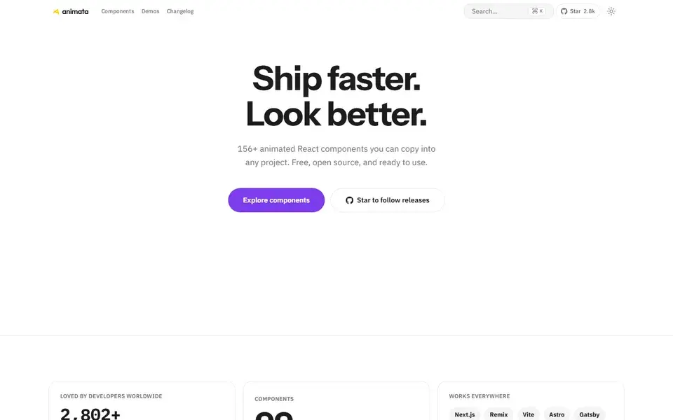
animata.design
About 130 hand-crafted animated React components built with Tailwind CSS v4 — text effects, backgrounds, cards, widgets and bento grids — installed with the shadcn CLI.
Animata is a library of roughly 130 animated UI primitives for React and Tailwind CSS v4, each with a live preview, source code and install command. Categories cover text effects such as split, glitch, typing and wave reveal, plus backgrounds, image reveals, lists, containers, cards, tabs, loading skeletons, widgets, bento grids, heroes and floating action buttons.
Components install through the shadcn CLI from a registry path like https://animata.design/r/{category}/{component}.json, or by copying the source. The project is free and open source, with the library code hosted on GitHub.
A shadcn/ui registry of opinionated React components, from WebGL shaders and animated backgrounds to footers, 404 pages and a gooey colour picker, installed by CLI so you own the code.
23rd.devAnimate UI replaces shadcn/ui primitives with animated versions built on Radix UI, Base UI and React Aria, driven by Motion.
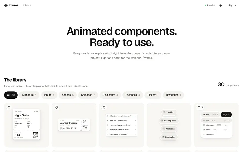
Library of live animated UI components for the web and SwiftUI, where each entry plays in the browser and its code can be copied straight into a project.