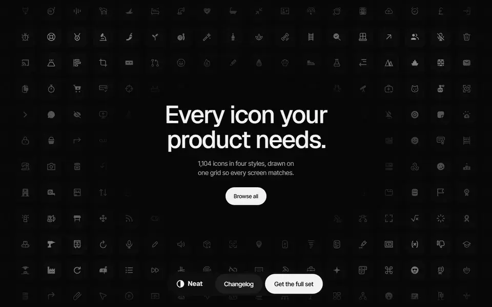
A 1,104-icon set drawn on one 24px grid in Rounded and Sharp plus Line and Solid, shipped as Figma component sets, SVG files and a typed React package.
icons
 neaticons.com
A component library is a long-term dependency, not a one-off download. The collection covers copy-paste primitives, installed packages and animated marketing kits; the criteria below separate what you own from what you rent, and what each choice costs in maintenance.
83 resources in this category
83 resources
A 1,104-icon set drawn on one 24px grid in Rounded and Sharp plus Line and Solid, shipped as Figma component sets, SVG files and a typed React package.
neaticons.com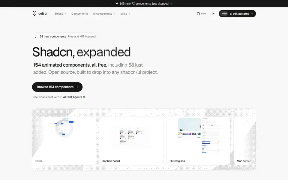
154 free, MIT-licensed animated shadcn/ui components and blocks, from a globe and kanban board to Apple device mockups, installed by copy-paste or one CLI line.
 cult-ui.com
65 React components, 9 hooks and 5 utilities built on Base UI and Tailwind CSS v4, added through the shadcn CLI so the source lands in your project under MIT.
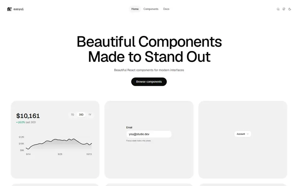
An open-source set of 131 micro-animated React components distributed through the shadcn GitHub registry, using spring physics and copy-paste source ownership.
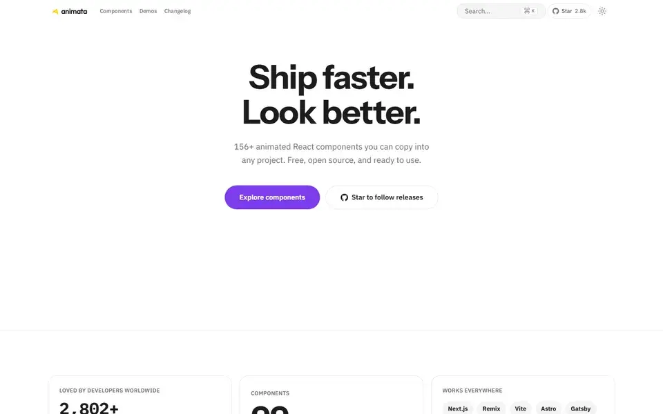
About 130 hand-crafted animated React components built with Tailwind CSS v4 — text effects, backgrounds, cards, widgets and bento grids — installed with the shadcn CLI.
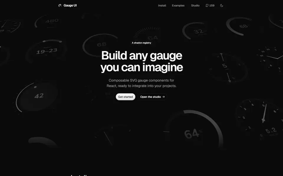
Composable SVG gauge primitives for React — arcs, ticks, zones and needles — distributed as a shadcn registry for building speedometers, dials and meters.
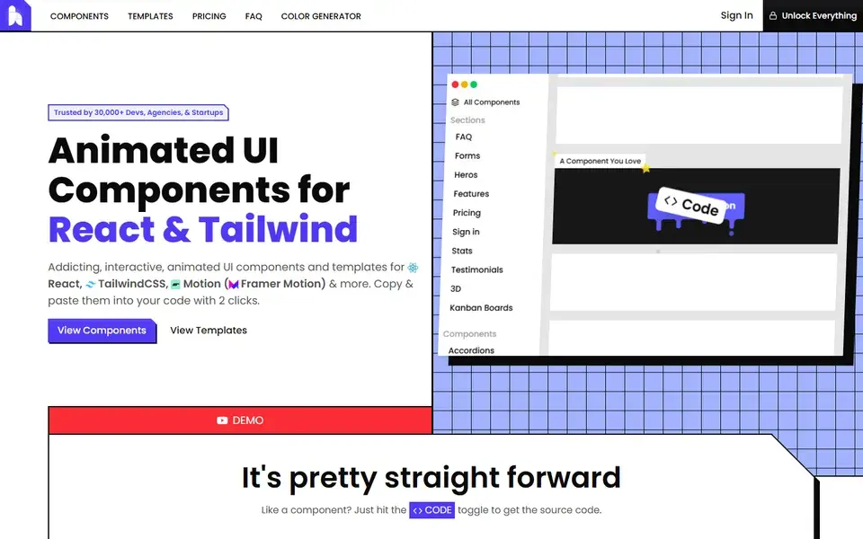
A copy-and-paste library of animated React and Tailwind CSS components and page sections built with Motion, where every demo exposes its full source through a code toggle.
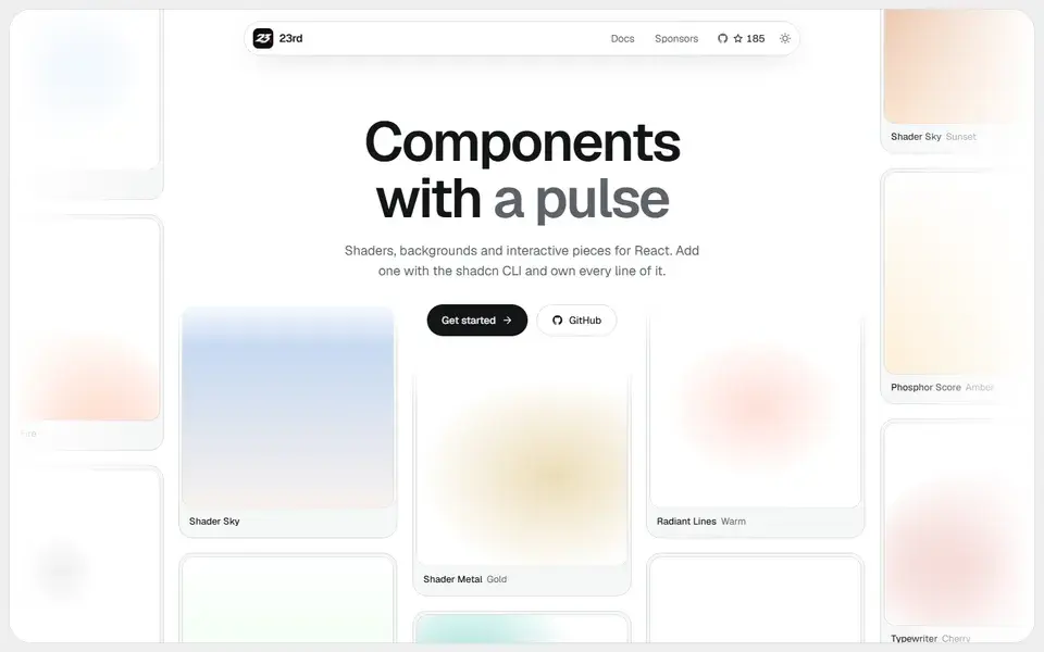
A shadcn/ui registry of opinionated React components, from WebGL shaders and animated backgrounds to footers, 404 pages and a gooey colour picker, installed by CLI so you own the code.
 23rd.dev
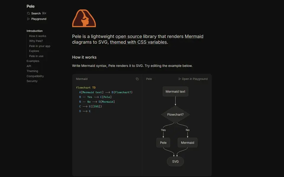
Pele renders Mermaid diagram syntax to SVG and themes the result with CSS variables instead of a theme configuration.
Animate UI replaces shadcn/ui primitives with animated versions built on Radix UI, Base UI and React Aria, driven by Motion.
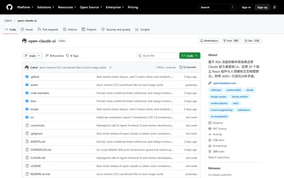
Open-source React and CSS library that reconstructs Claude's desktop chat interface, shipping 30 component modules plus the motion and scroll physics behind them.
 github.com
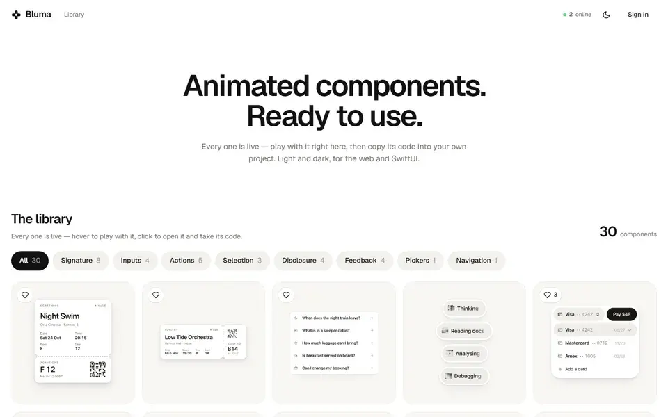
Library of live animated UI components for the web and SwiftUI, where each entry plays in the browser and its code can be copied straight into a project.
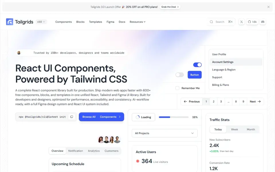
React and Tailwind CSS component library with 600+ components and blocks, a CLI, prebuilt templates and a matching Figma design system.
 tailgrids.com

Open-source React design system of 126 components and 42 blocks exported 1:1 from Figma, with glass and liquid-glass surface themes.
 sakaniui.com
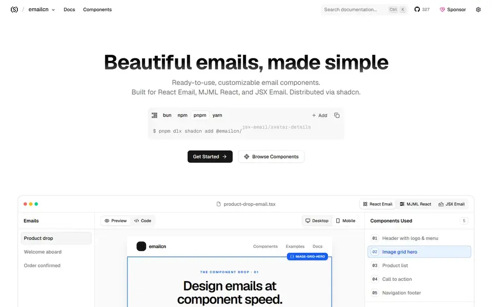
Open-source collection of beautifully designed, accessible email components for React Email, MJML React and JSX Email, copy-paste ready and compatible with shadcn/ui.
 emailcn.run
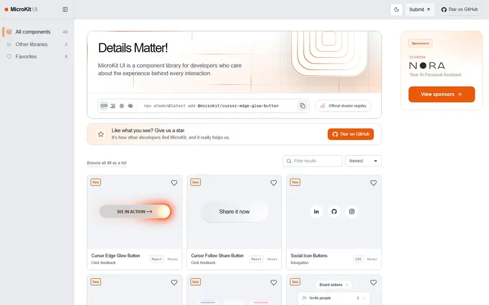
49 free copy-paste microinteractions for React, CSS and Tailwind — animated buttons, hover effects, tabs and inputs with no package to install.
 microkit.co
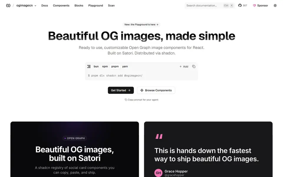
A collection of beautifully designed, customizable Open Graph image components built on Satori and compatible with the shadcn/ui workflow.
 ogimagecn.com
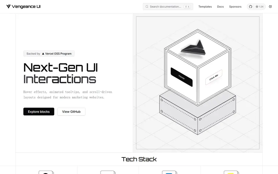
Open-source animated React components and next-gen UI interactions — displacement hovers, animated tooltips and scroll-driven cards installed via the shadcn CLI.
 vengeanceui.com
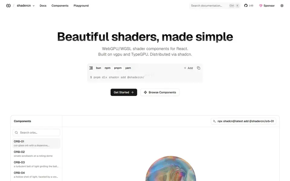
Beautifully designed, accessible and customizable shader components for React — built on vgpu and TypeGPU and made to work alongside shadcn/ui.
 shadercn.run

A free, open-source React component library built on Base UI, styled with Tailwind, animated with Motion — 70+ polished components for humans and AI agents.
 appica.dev
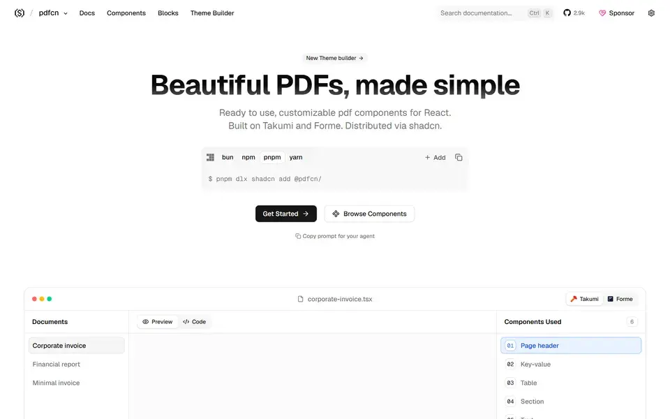
Beautifully designed, accessible and customizable PDF components — built on Takumi and Forme and made to work with shadcn/ui.
 pdfcn.dev
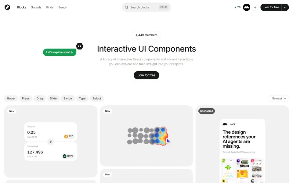
A library of interactive React UI blocks — heat maps, signature pads, drag interactions, sliders — you can explore, tweak, and take straight into projects.
 bencho.dev
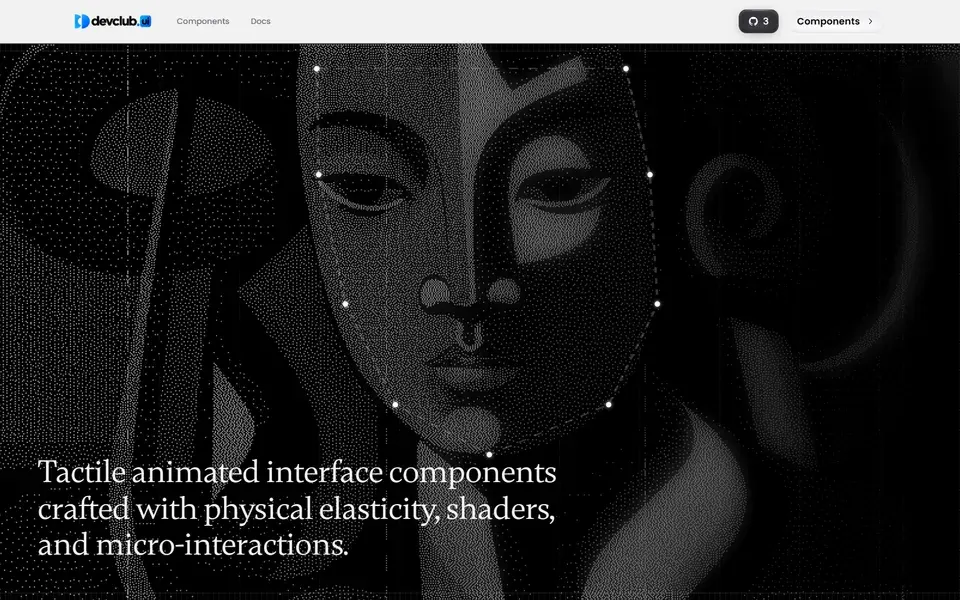
Open-source component library engineered for speed and visual excellence, with copy-paste components built around physical elasticity, shaders, and micro-interactions.
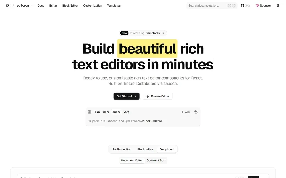
Ready-to-use, customizable rich text editor components for React, built on Tiptap and distributed via shadcn so you own the code.
 rtecn.space
Copy-paste libraries put the source in your repository: you can restyle any component and you carry the upgrade work yourself. Installed packages update centrally but constrain styling to their extension points. shadcn/ui popularized the first model; Radix, Base UI and MUI represent the second. Decide which trade-off fits the team before adopting either.
Check what the library builds on. Components layered over Radix UI or Base UI inherit tested focus management, keyboard interaction and ARIA behavior. Purely visual component sets often leave those details to you. Tab through a menu, open a dialog with Escape and run a screen reader before committing.
Read the install path and the update history: does it target your React and Tailwind versions, and did it ship fixes in the last few months? A component set tied to an abandoned styling layer becomes upgrade debt quickly, especially when Tailwind majors change utilities.
The clearest copy-paste baseline: accessible Radix primitives styled with Tailwind, with the component source living in your repo. Best when the team wants to own and retheme the UI layer — budget time for maintaining the copied code.
Animated React sections and effects built on Tailwind and Motion. It layers visual polish on top of an existing component system rather than replacing it — a good second library for marketing pages, not the foundation for dense app UI.
A free core of high-impact animated components plus paid Pro templates, aimed at launch and agency pages. Strongest where a first impression matters most; verify the license and bundle impact before using the effects throughout a product.