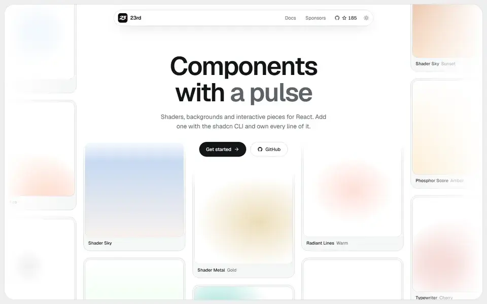
A shadcn/ui registry of opinionated React components, from WebGL shaders and animated backgrounds to footers, 404 pages and a gooey colour picker, installed by CLI so you own the code.
components
 23rd.dev
bluma.design
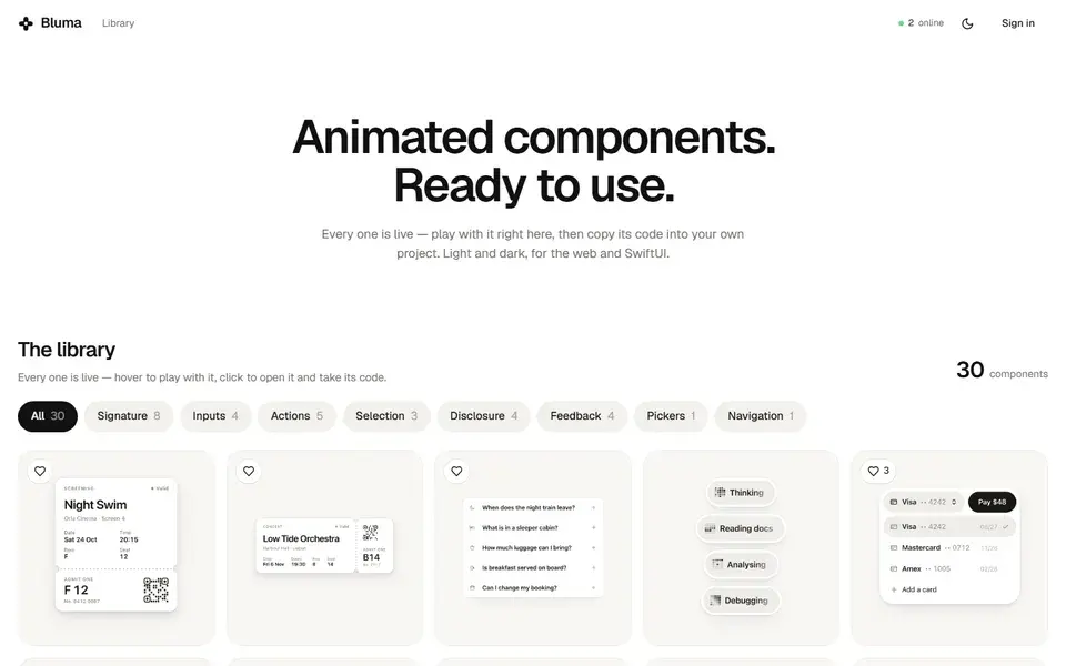
Library of live animated UI components for the web and SwiftUI, where each entry plays in the browser and its code can be copied straight into a project.
Bluma presents animated components running in the page itself: hover to play with an entry, click to open it and take its code. Each component ships in light and dark variants and targets both the web and SwiftUI, so the same interaction can be reused across a site and a native Apple app.
The site also runs an AI builder: describe a component and Bluma writes it, builds it in front of you and tests it in a real browser, after which copy, colours, spacing and behaviour can be changed by asking. That mode sits behind sign-in, and the component library stays browsable without it.
A shadcn/ui registry of opinionated React components, from WebGL shaders and animated backgrounds to footers, 404 pages and a gooey colour picker, installed by CLI so you own the code.
23rd.dev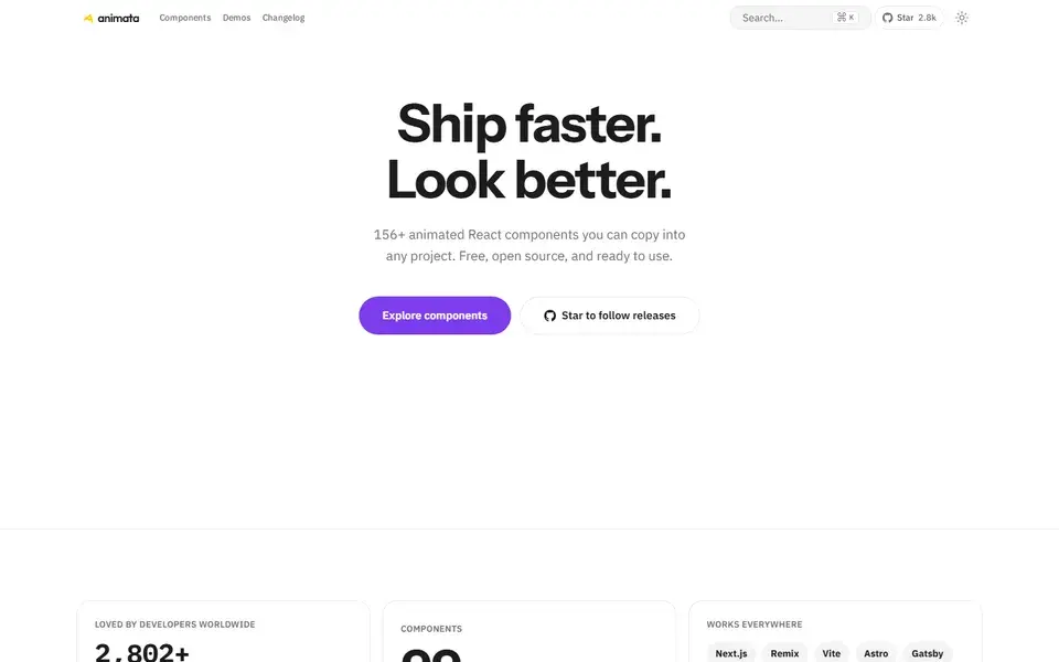
About 130 hand-crafted animated React components built with Tailwind CSS v4 — text effects, backgrounds, cards, widgets and bento grids — installed with the shadcn CLI.
Animate UI replaces shadcn/ui primitives with animated versions built on Radix UI, Base UI and React Aria, driven by Motion.