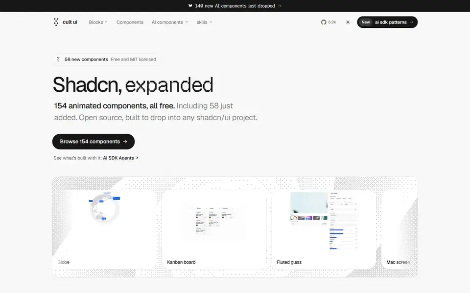
154 free, MIT-licensed animated shadcn/ui components and blocks, from a globe and kanban board to Apple device mockups, installed by copy-paste or one CLI line.
components
 cult-ui.com
39 curated resources tagged components. Refine them with search and filters.
154 free, MIT-licensed animated shadcn/ui components and blocks, from a globe and kanban board to Apple device mockups, installed by copy-paste or one CLI line.
cult-ui.com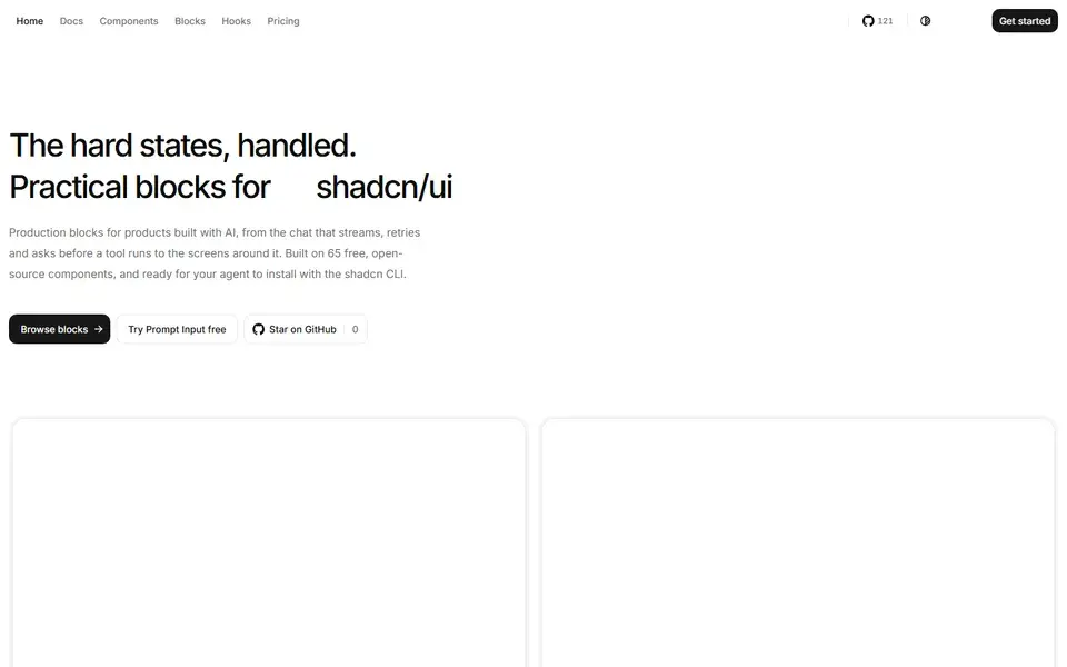
65 React components, 9 hooks and 5 utilities built on Base UI and Tailwind CSS v4, added through the shadcn CLI so the source lands in your project under MIT.
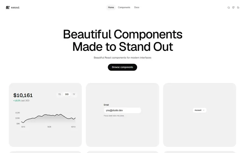
An open-source set of 131 micro-animated React components distributed through the shadcn GitHub registry, using spring physics and copy-paste source ownership.
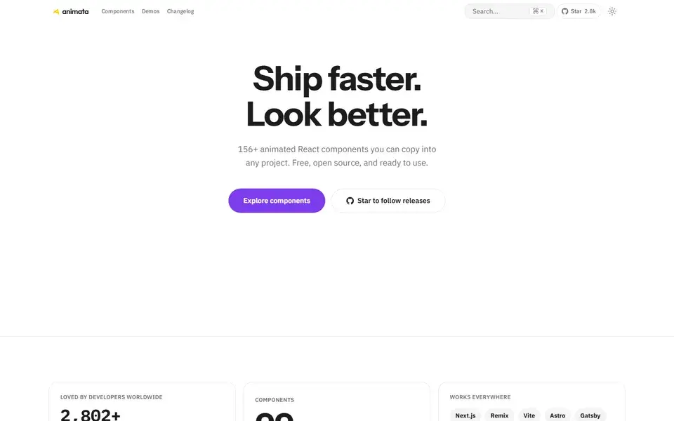
About 130 hand-crafted animated React components built with Tailwind CSS v4 — text effects, backgrounds, cards, widgets and bento grids — installed with the shadcn CLI.
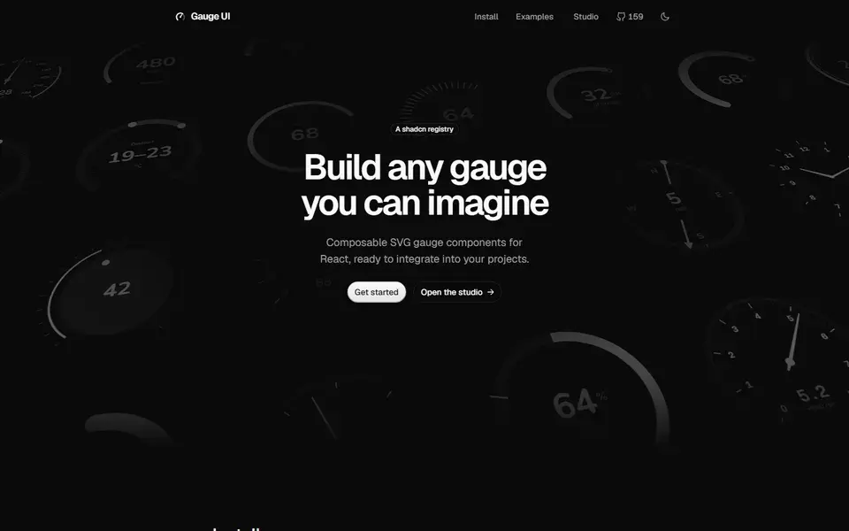
Composable SVG gauge primitives for React — arcs, ticks, zones and needles — distributed as a shadcn registry for building speedometers, dials and meters.
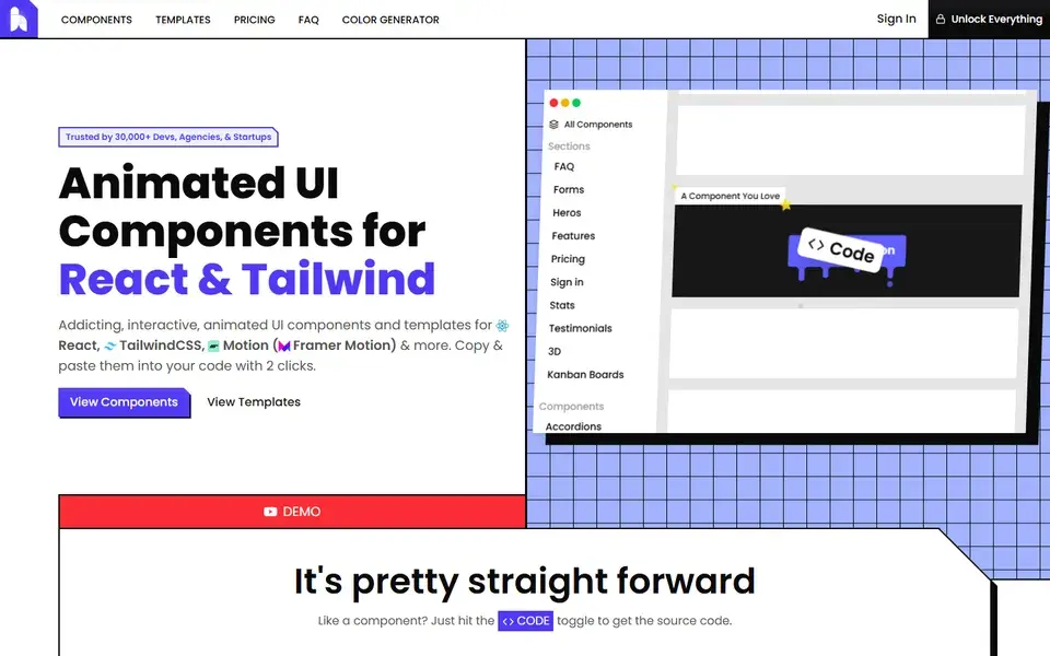
A copy-and-paste library of animated React and Tailwind CSS components and page sections built with Motion, where every demo exposes its full source through a code toggle.
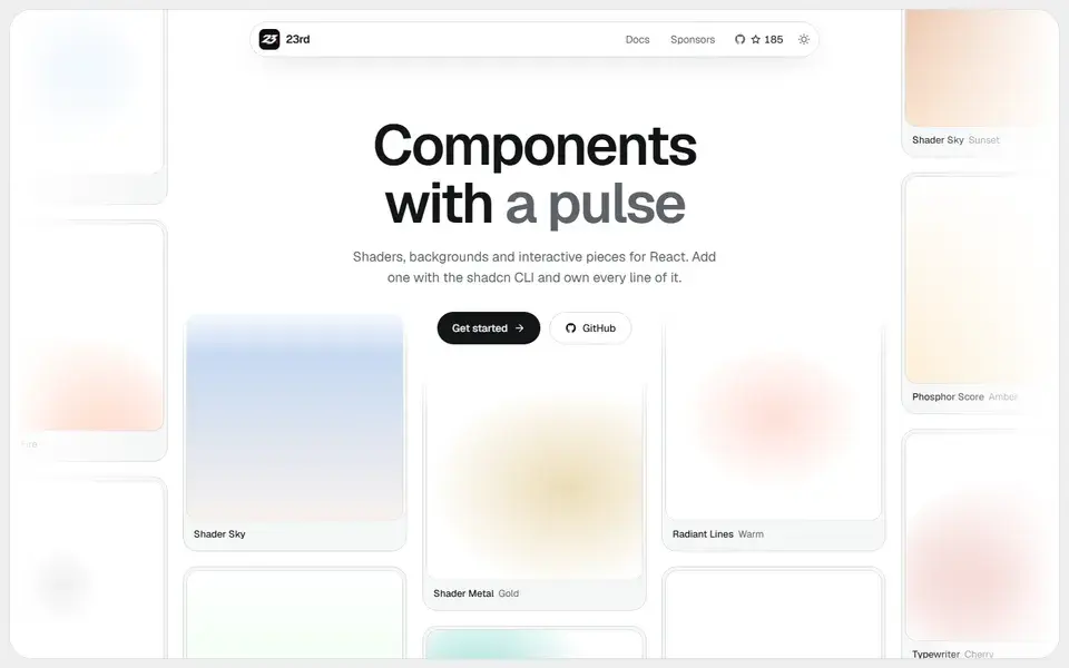
A shadcn/ui registry of opinionated React components, from WebGL shaders and animated backgrounds to footers, 404 pages and a gooey colour picker, installed by CLI so you own the code.
 23rd.dev
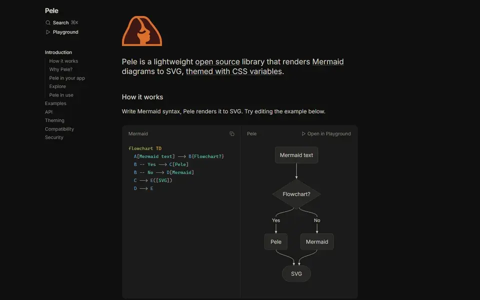
Pele renders Mermaid diagram syntax to SVG and themes the result with CSS variables instead of a theme configuration.
Animate UI replaces shadcn/ui primitives with animated versions built on Radix UI, Base UI and React Aria, driven by Motion.
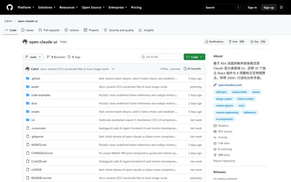
Open-source React and CSS library that reconstructs Claude's desktop chat interface, shipping 30 component modules plus the motion and scroll physics behind them.
 github.com
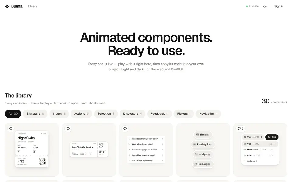
Library of live animated UI components for the web and SwiftUI, where each entry plays in the browser and its code can be copied straight into a project.
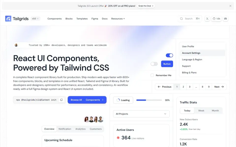
React and Tailwind CSS component library with 600+ components and blocks, a CLI, prebuilt templates and a matching Figma design system.
 tailgrids.com

Open-source React design system of 126 components and 42 blocks exported 1:1 from Figma, with glass and liquid-glass surface themes.
 sakaniui.com
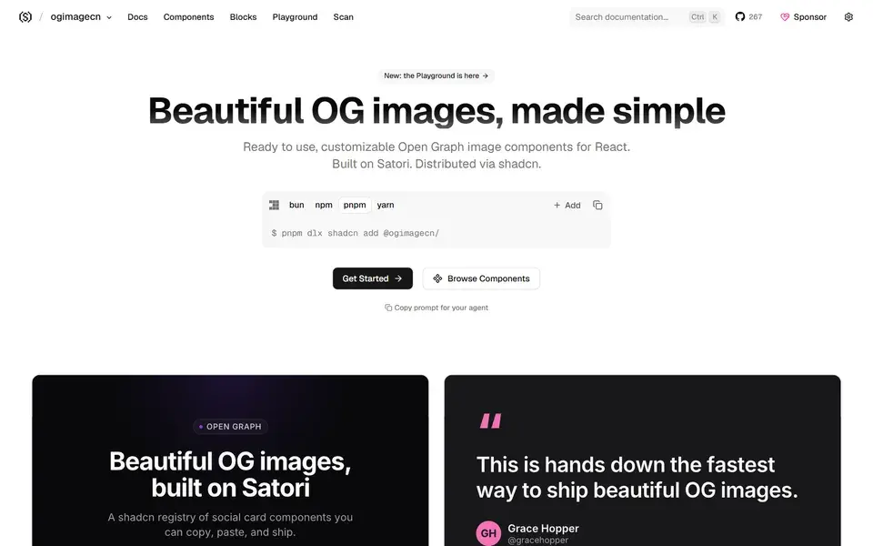
A collection of beautifully designed, customizable Open Graph image components built on Satori and compatible with the shadcn/ui workflow.
 ogimagecn.com
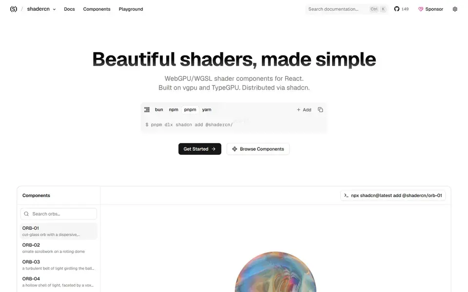
Beautifully designed, accessible and customizable shader components for React — built on vgpu and TypeGPU and made to work alongside shadcn/ui.
 shadercn.run
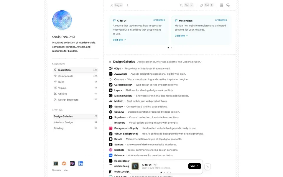
Curated directory of interface craft — component libraries, design systems, AI design tools, and inspiration, plus a list of people worth following.
 designeer.xyz
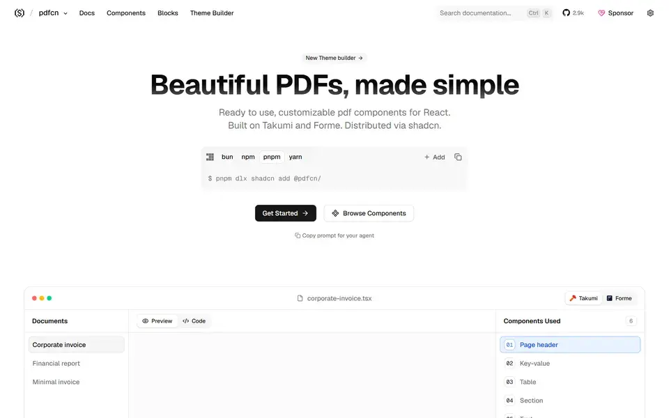
Beautifully designed, accessible and customizable PDF components — built on Takumi and Forme and made to work with shadcn/ui.
 pdfcn.dev
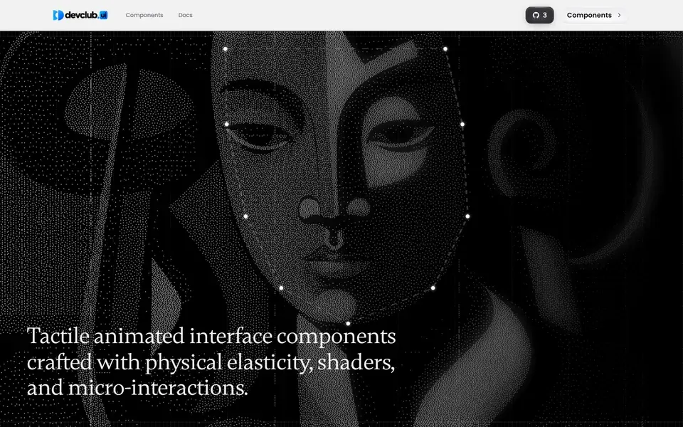
Open-source component library engineered for speed and visual excellence, with copy-paste components built around physical elasticity, shaders, and micro-interactions.
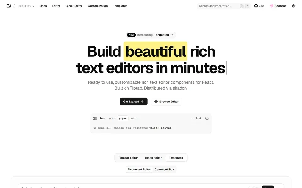
Ready-to-use, customizable rich text editor components for React, built on Tiptap and distributed via shadcn so you own the code.
 rtecn.space

Agent-ready React components, screens, and blocks for AI products and SaaS — one dependency-free file each, added by hand or by Claude, Cursor, or v0.
 affectui.com
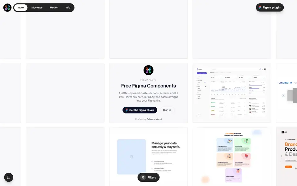
Free, curated library of copy-paste Figma components, UI kits, and ready-made design sections for assembling polished designs faster.
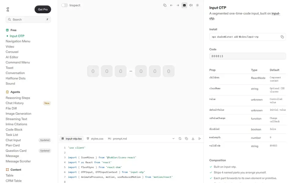
Polished, copy-paste React components built with Tailwind CSS — every state designed, in light and dark, with AI-ready prompt files included.

A curated library of free Framer and Figma components, templates and UI design tools for streamlining the design process.
 sprrrint.com
Polished React motion components you can copy with live previews, source code, dependencies and shadcn registry commands.
 skecher-ui.com
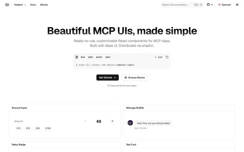
Beautifully designed, accessible MCP App UI components built with Base UI, copy-paste installable and compatible with shadcn/ui.
 mcpcn.dev
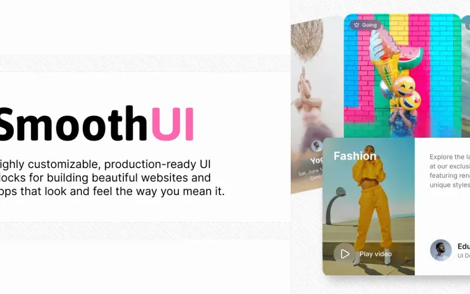
198 free, MIT-licensed animated React components with smooth Motion animations — drop-in shadcn/ui compatible and fully customizable with Tailwind CSS.
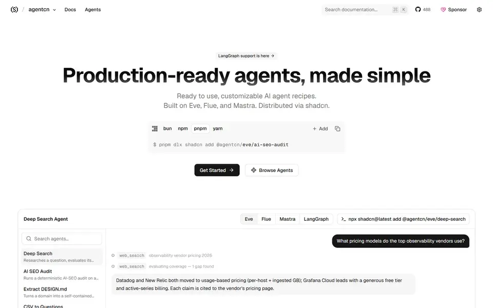
A shadcn-style registry of production-ready AI agent recipes built on Eve, Flue and Mastra — copy, paste and ship complete agent patterns.
 agentcn.run
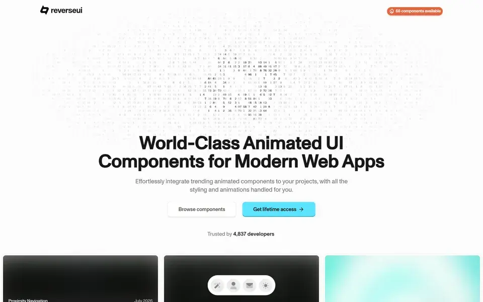
A premium collection of 50+ customizable, ready-to-use animated UI components for modern web apps — easy to integrate and fully styled.
 reverseui.com
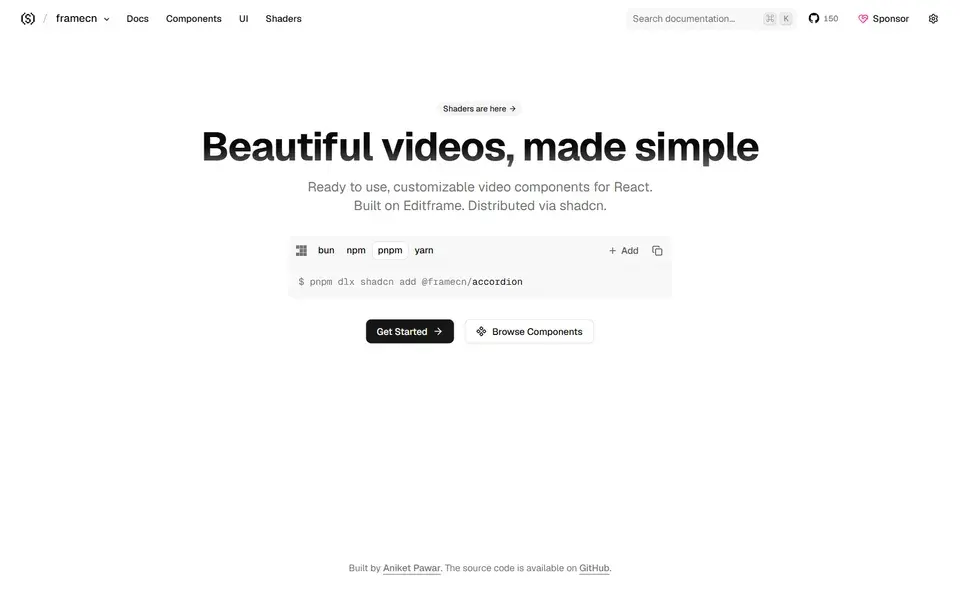
Beautifully designed, customizable video components for React, built on Editframe and copy-paste installable alongside shadcn/ui.
 framecn.dev
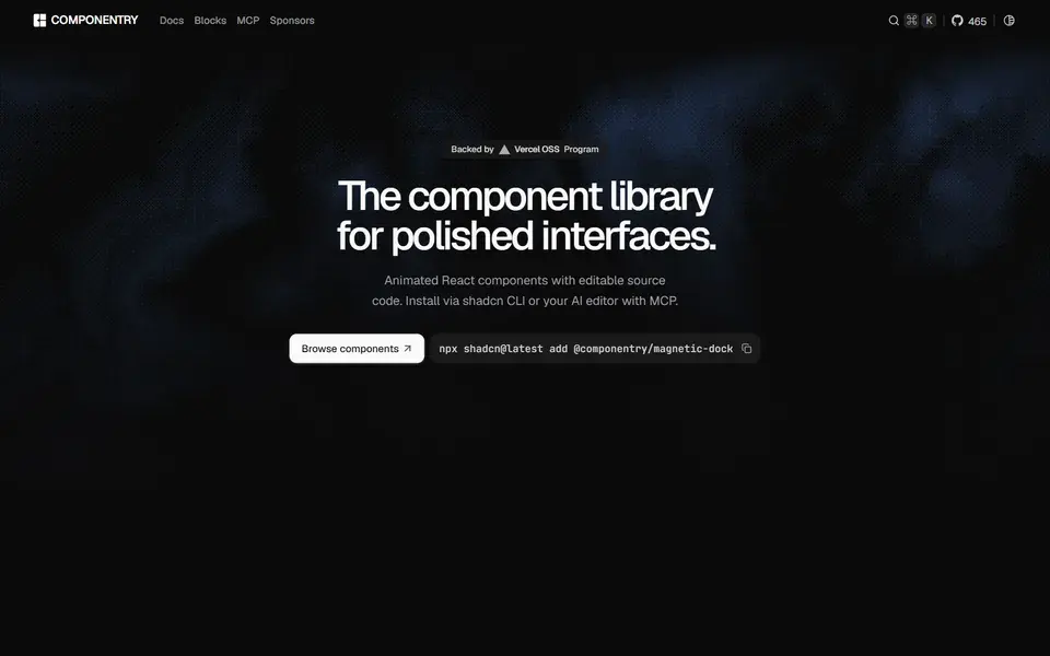
Beautiful, animated React UI components with styling and motion already handled — built with Tailwind CSS, TypeScript and Framer Motion.
 componentry.dev
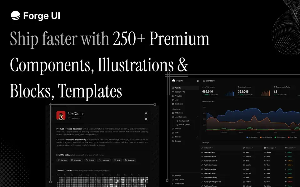
React and Tailwind UI library with animated components, marketing blocks, illustrations and copy-paste templates — shadcn-compatible, with free and Pro tiers.
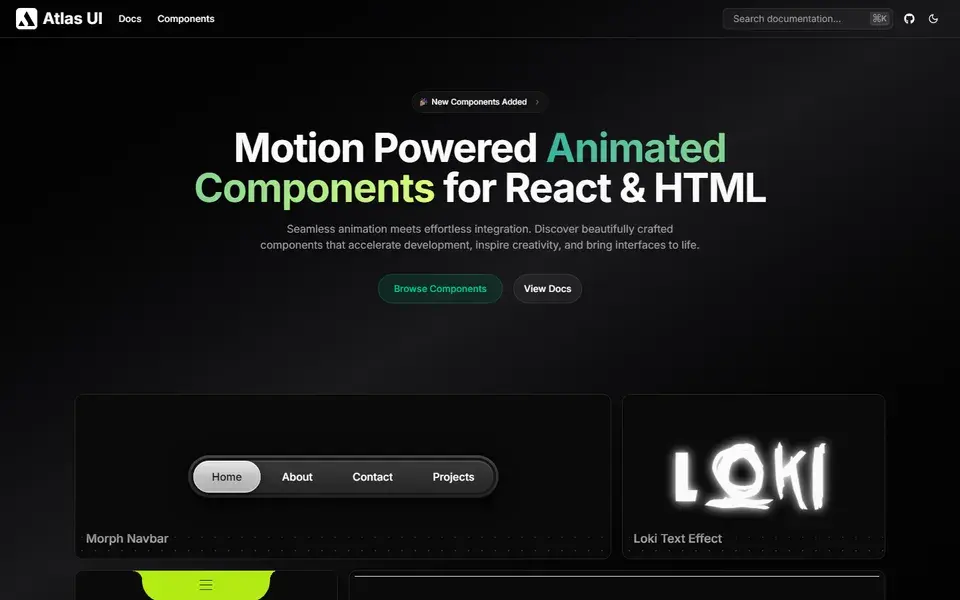
Open-source, motion-powered animated components for React and HTML — beautifully crafted pieces that bring interfaces to life with seamless animations.
 atlasui.dev
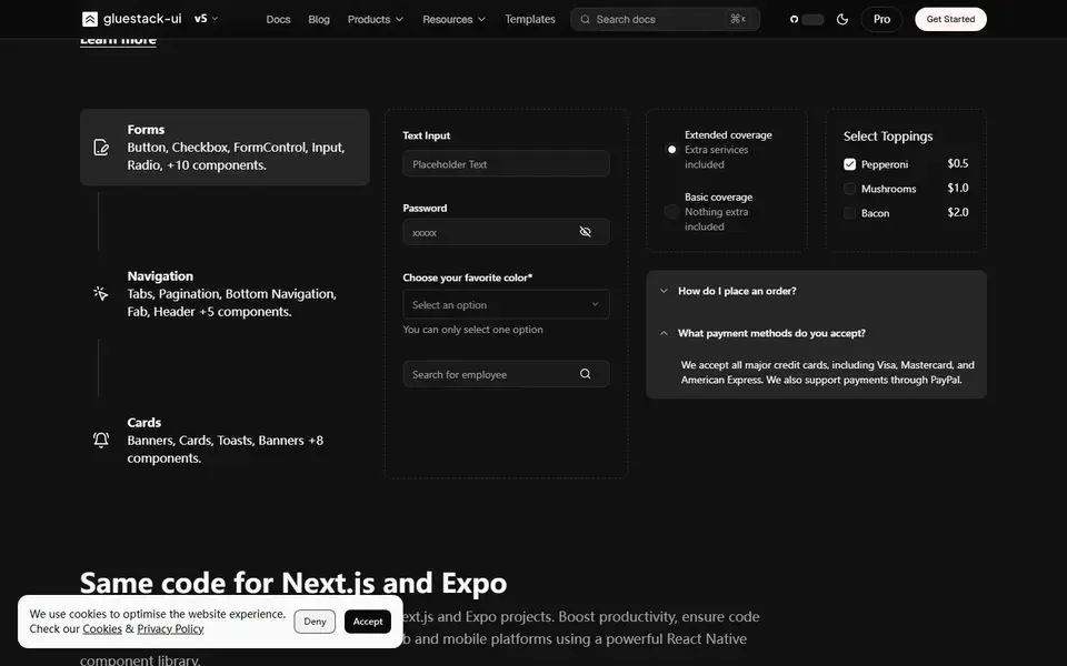
Open-source React and React Native components crafted with Tailwind CSS and NativeWind — one copy-paste library shared across web, Next.js and Expo apps.
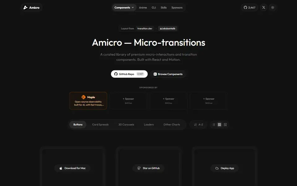
160+ copy-paste React components for motion, transitions and UI effects — morphing buttons, 3D carousels, loaders and chart animations.
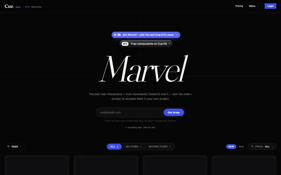
Cue curates Awwwards-tier components, animations and hero flows, each shipping with AI prompts for Cursor, v0, Bolt and Claude.
 cuedesign.space
 Featured
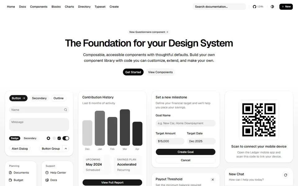
Beautifully designed components that you can copy and paste into your apps. Accessible, customizable and open source — built on Radix UI and Tailwind CSS.
 ui.shadcn.com
 Featured
150+ animated components built with React, Tailwind CSS and Motion. Copy-paste landing page sections and effects that make marketing sites stand out.
 magicui.design
 Featured
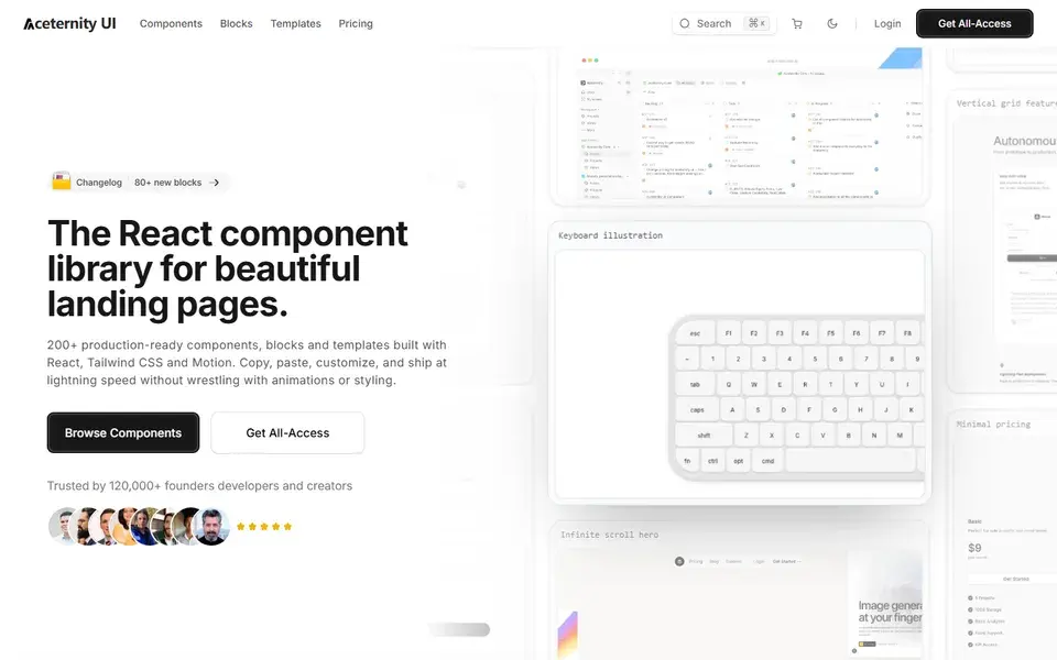
Stunning animated components and effects built with Next.js, Tailwind CSS and Framer Motion. A go-to source for hero sections with visual punch.
 ui.aceternity.com
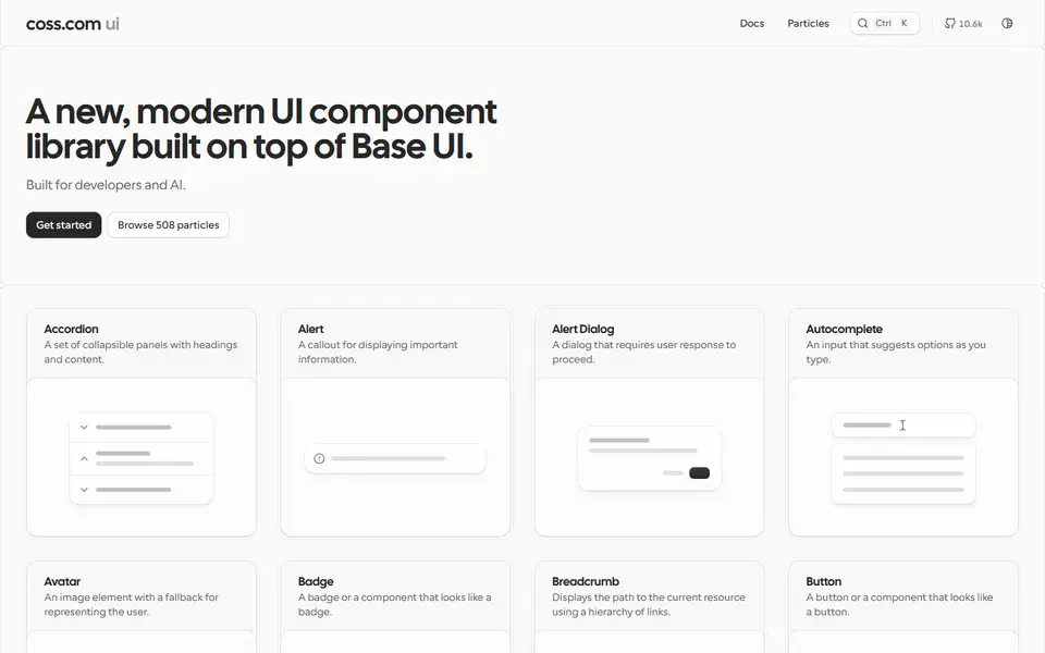
A large collection of copy-paste components built on top of shadcn/ui and Tailwind CSS — forms, layouts and application UI patterns for real products.