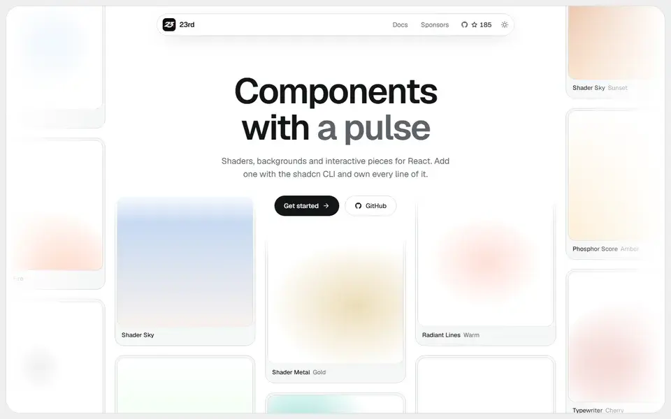
A shadcn/ui registry of opinionated React components, from WebGL shaders and animated backgrounds to footers, 404 pages and a gooey colour picker, installed by CLI so you own the code.
components
 23rd.dev

gauge-ui.dev
Composable SVG gauge primitives for React — arcs, ticks, zones and needles — distributed as a shadcn registry for building speedometers, dials and meters.
Gauge UI provides gauge building blocks for React rather than a finished charting library: arcs, ticks, zones and needles that you combine into speedometers, dials, meters and clocks. Install with npx shadcn@latest add https://gauge-ui.dev/r/gauge.json, then compose the pieces; the source lives in your project.
The site demonstrates the primitives across dashboard and device interfaces — CPU load, memory and swap, network throughput, weather compasses, tachometers, timers and health metrics — and includes a studio for assembling gauges visually. Linear gauges are the most recent addition.
A shadcn/ui registry of opinionated React components, from WebGL shaders and animated backgrounds to footers, 404 pages and a gooey colour picker, installed by CLI so you own the code.
23rd.dev
About 130 hand-crafted animated React components built with Tailwind CSS v4 — text effects, backgrounds, cards, widgets and bento grids — installed with the shadcn CLI.
Animate UI replaces shadcn/ui primitives with animated versions built on Radix UI, Base UI and React Aria, driven by Motion.