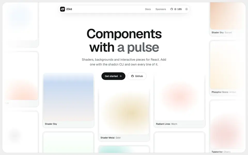
A shadcn/ui registry of opinionated React components, from WebGL shaders and animated backgrounds to footers, 404 pages and a gooey colour picker, installed by CLI so you own the code.
components
 23rd.dev
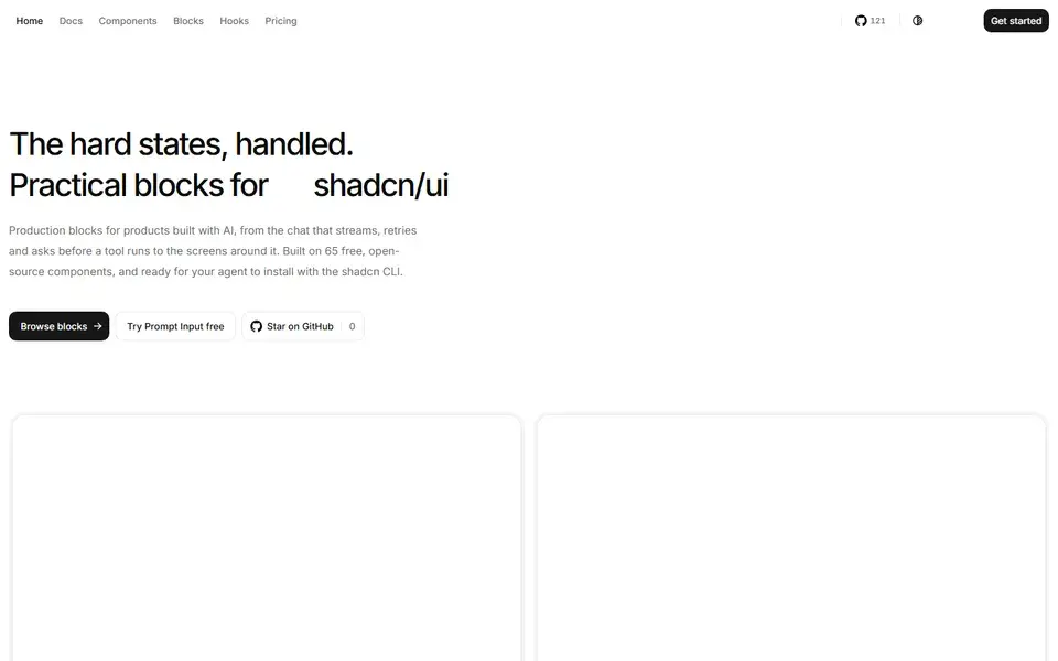
hextaui.com
65 React components, 9 hooks and 5 utilities built on Base UI and Tailwind CSS v4, added through the shadcn CLI so the source lands in your project under MIT.
HextaUI provides 65 components, 9 hooks and 5 utilities for React, with behavior and accessibility from Base UI, styling through Tailwind CSS v4 theme tokens and icons from Tabler. Install a piece with npx shadcn@latest add https://hextaui.com/r/<name>.json; there is no npm package, the source is copied in and owned by the project.
Components ship with finished states such as loading, disabled, invalid, empty and reduced-motion fallbacks, and docs are readable as Markdown or through an MCP server and OpenAPI-described HTTP API. The core library is MIT licensed and free for personal and commercial use; HextaUI Pro adds blocks for AI chat interfaces — message scroller, prompt input with attachments, streaming text, tool calls and voice mode.
A shadcn/ui registry of opinionated React components, from WebGL shaders and animated backgrounds to footers, 404 pages and a gooey colour picker, installed by CLI so you own the code.
23rd.dev
About 130 hand-crafted animated React components built with Tailwind CSS v4 — text effects, backgrounds, cards, widgets and bento grids — installed with the shadcn CLI.
Animate UI replaces shadcn/ui primitives with animated versions built on Radix UI, Base UI and React Aria, driven by Motion.