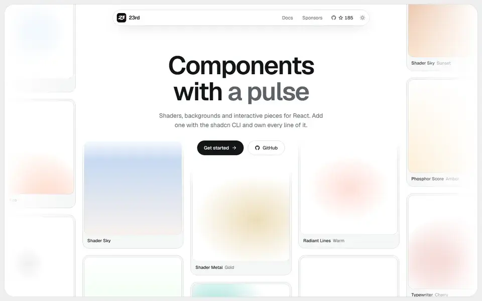
A shadcn/ui registry of opinionated React components, from WebGL shaders and animated backgrounds to footers, 404 pages and a gooey colour picker, installed by CLI so you own the code.
components
 23rd.dev
hover.dev
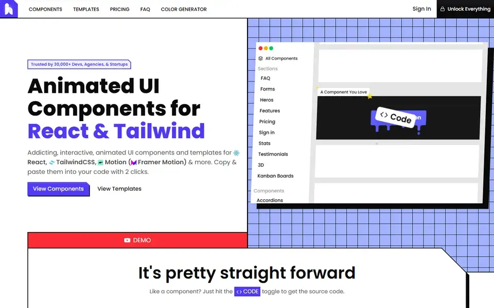
A copy-and-paste library of animated React and Tailwind CSS components and page sections built with Motion, where every demo exposes its full source through a code toggle.
Hover.dev groups its library into sections such as heroes, pricing, stats, FAQ, forms, sign-in, kanban boards and 3D, and into components such as buttons, navbars, carousels, dropdown menus, toggles, loaders and tables. Each entry shows a live demo; flipping the code toggle reveals the JSX in JavaScript or TypeScript with Tailwind classes and Motion animations, ready to paste into a project rather than install as a package.
Basic components are free, and Hover Pro is sold as a one-time $149 lifetime licence that covers every component and template with unlimited use, new additions and priority component suggestions. The site states the library is used by 30,000+ developers, agencies and startups, and keeps components aligned with current React, Tailwind and animation library versions.
A shadcn/ui registry of opinionated React components, from WebGL shaders and animated backgrounds to footers, 404 pages and a gooey colour picker, installed by CLI so you own the code.
23rd.dev
About 130 hand-crafted animated React components built with Tailwind CSS v4 — text effects, backgrounds, cards, widgets and bento grids — installed with the shadcn CLI.
Animate UI replaces shadcn/ui primitives with animated versions built on Radix UI, Base UI and React Aria, driven by Motion.