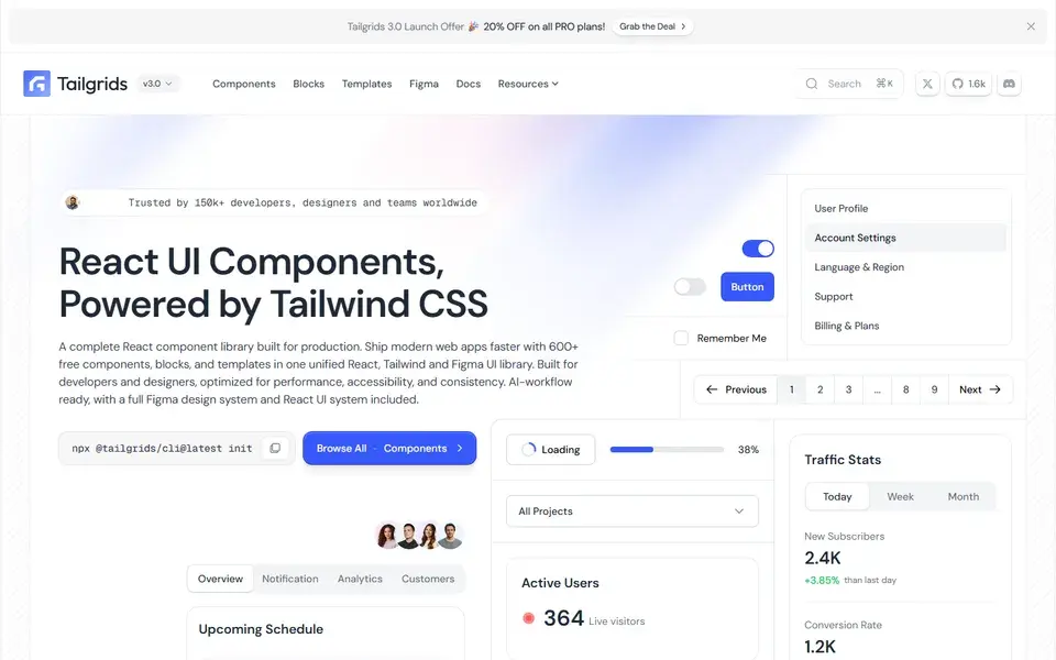
React and Tailwind CSS component library with 600+ components and blocks, a CLI, prebuilt templates and a matching Figma design system.
ReactTailwindComponents+1
 tailgrids.com
42 curated resources tagged Tailwind. Refine them with search and filters.
This page collects every resource tagged Tailwind — the framework itself, component collections, icon sets and design tooling. Not all of them are component libraries, so check what each one assumes about your stack before wiring it into a build.
React and Tailwind CSS component library with 600+ components and blocks, a CLI, prebuilt templates and a matching Figma design system.
tailgrids.com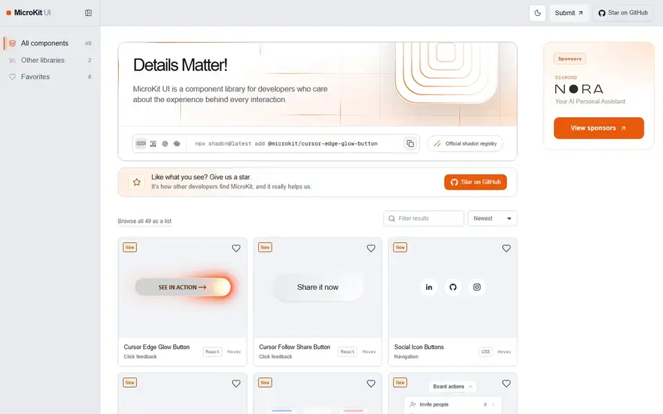
49 free copy-paste microinteractions for React, CSS and Tailwind — animated buttons, hover effects, tabs and inputs with no package to install.
 microkit.co
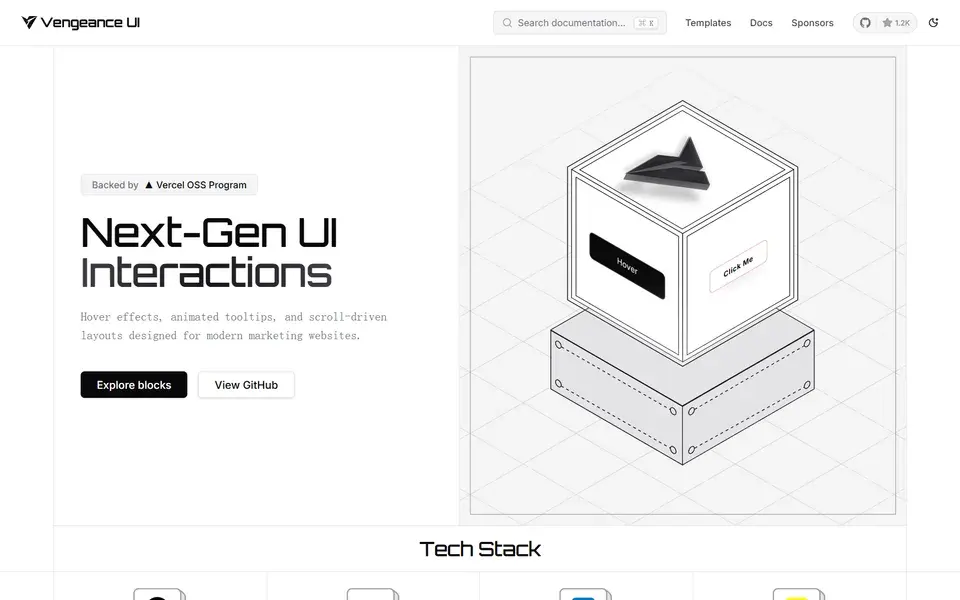
Open-source animated React components and next-gen UI interactions — displacement hovers, animated tooltips and scroll-driven cards installed via the shadcn CLI.
 vengeanceui.com
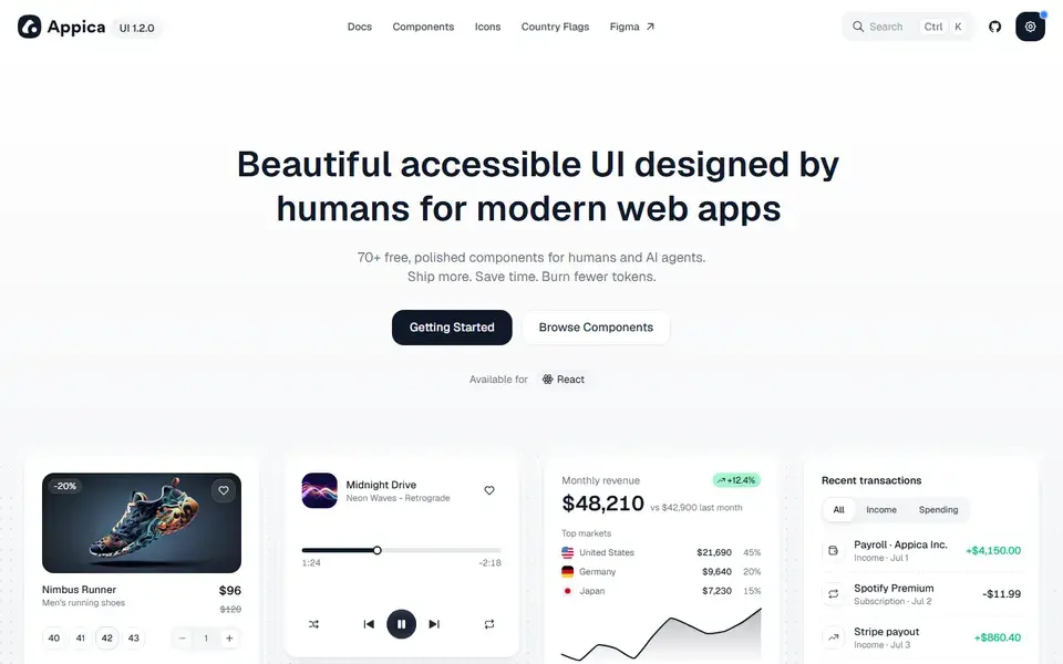
A free, open-source React component library built on Base UI, styled with Tailwind, animated with Motion — 70+ polished components for humans and AI agents.
 appica.dev
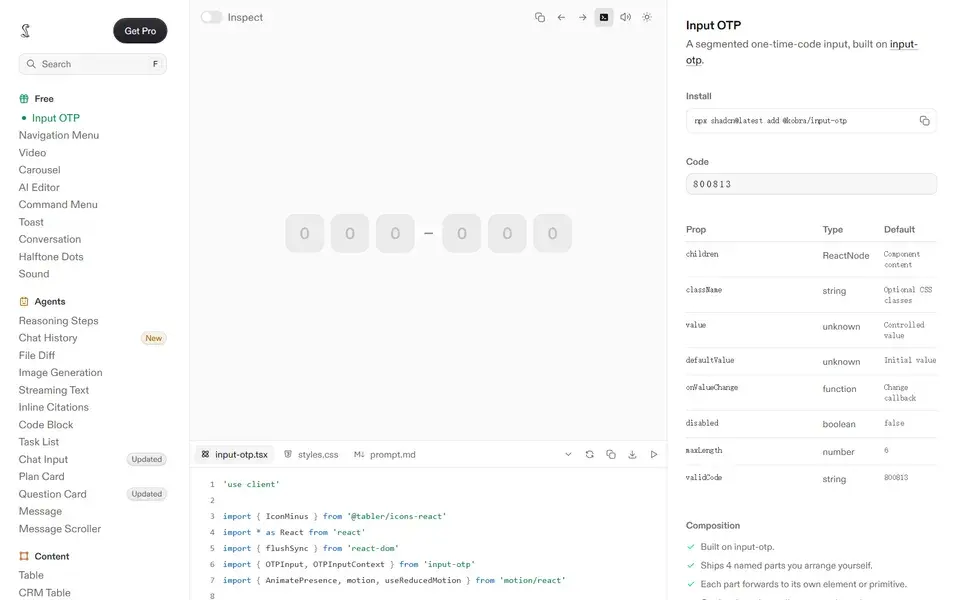
Polished, copy-paste React components built with Tailwind CSS — every state designed, in light and dark, with AI-ready prompt files included.
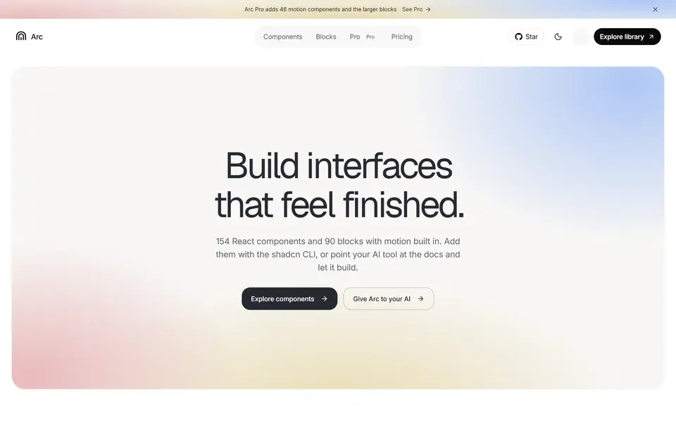
154 React components and 90 blocks with motion built in, installed as editable source via the shadcn CLI for shadcn/ui and Next.js projects.
 uiarc.dev
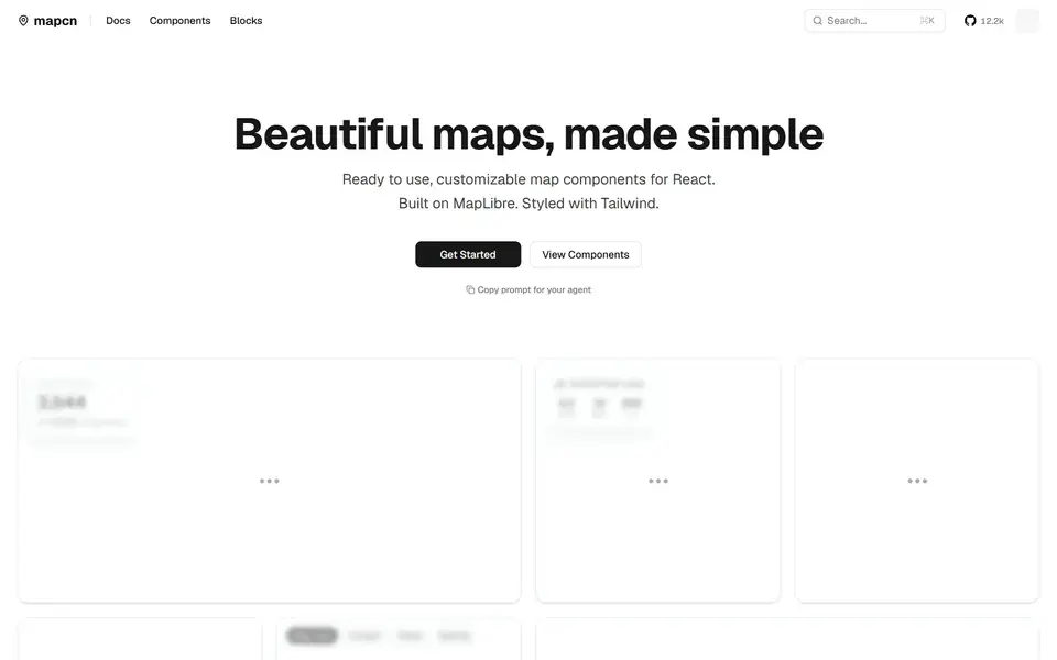
Free, open-source, customizable map components for React built on MapLibre GL, styled with Tailwind CSS and following the shadcn/ui pattern.
 mapcn.dev
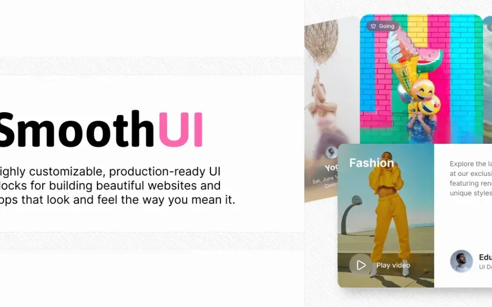
198 free, MIT-licensed animated React components with smooth Motion animations — drop-in shadcn/ui compatible and fully customizable with Tailwind CSS.
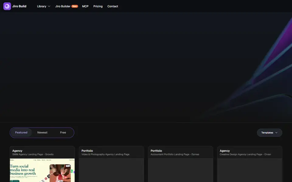
A design prompt library for vibe coders — browse 1,200+ animated templates and sections, copy an AI-ready prompt, and paste it into Bolt, Lovable, v0 or Cursor.
 jiro.build
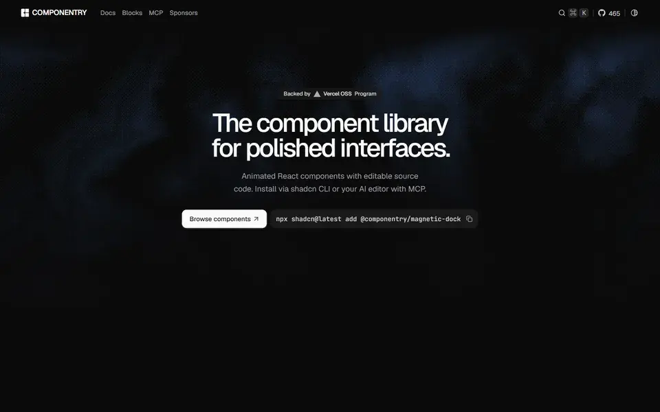
Beautiful, animated React UI components with styling and motion already handled — built with Tailwind CSS, TypeScript and Framer Motion.
 componentry.dev
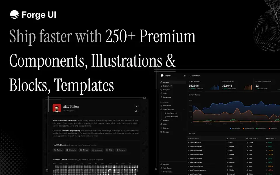
React and Tailwind UI library with animated components, marketing blocks, illustrations and copy-paste templates — shadcn-compatible, with free and Pro tiers.
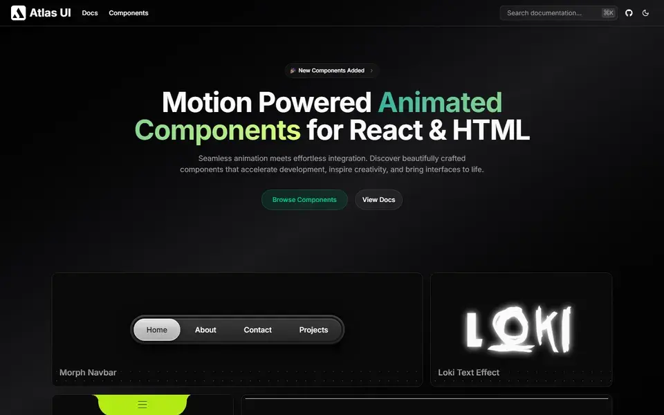
Open-source, motion-powered animated components for React and HTML — beautifully crafted pieces that bring interfaces to life with seamless animations.
 atlasui.dev
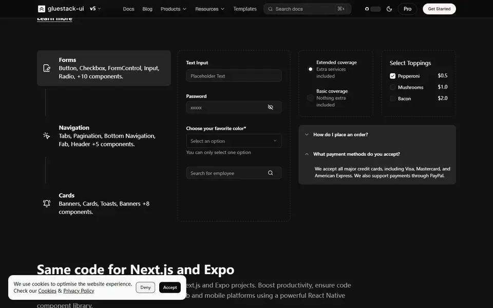
Open-source React and React Native components crafted with Tailwind CSS and NativeWind — one copy-paste library shared across web, Next.js and Expo apps.
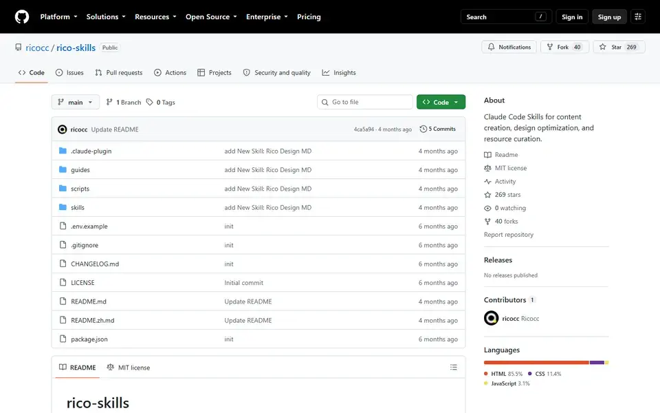
A Claude Code skills pack for design-adjacent work: curated resource articles, one-click website theme optimization, and design system document generation.
 github.com
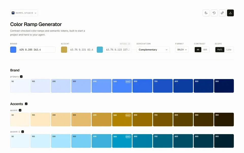
A color ramp generator built for handoff: perceptually-even OKLCH palettes with semantic tokens your agent can read as plain text or JSON.
 ramps.studio
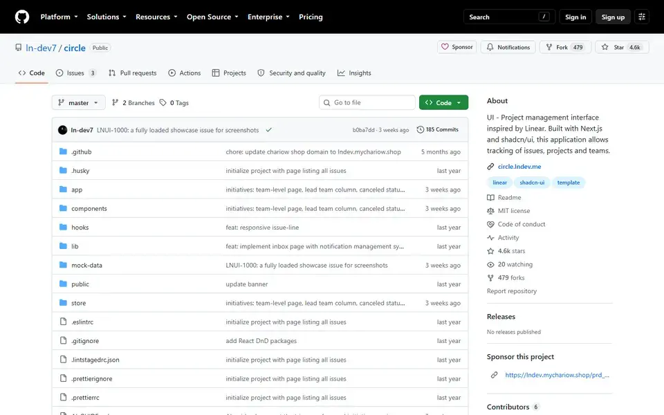
A Linear-inspired project management interface built with Next.js, shadcn/ui and Tailwind CSS for tracking issues, projects and teams.
 github.com
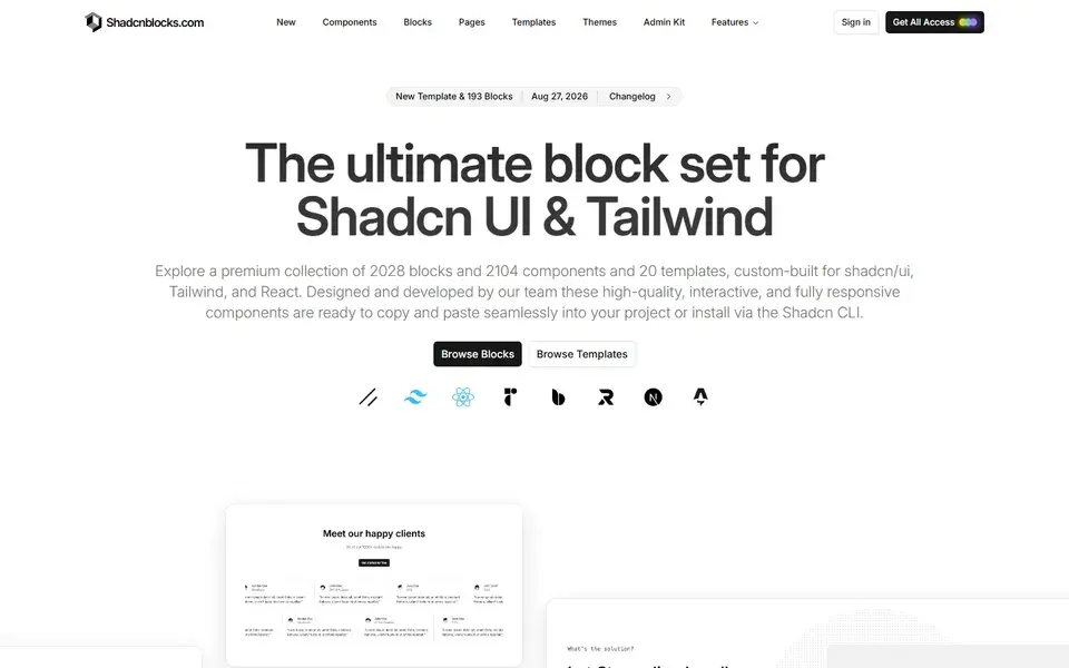
A premium set of 2,150+ extra blocks, 2,151 components and 21 templates for shadcn/ui, Tailwind and React — copy-paste or install via the shadcn CLI.
 shadcnblocks.com
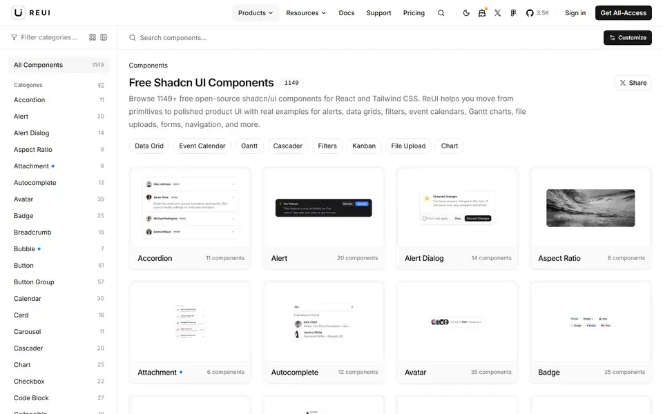
1,000+ free, open-source shadcn/ui components and React examples for Tailwind CSS, from data grids and Gantt charts to kanban boards and file uploads.
 reui.io
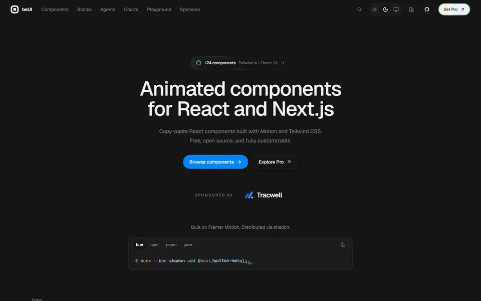
138 free, open-source animated components for React and Next.js, built with Motion and Tailwind CSS — copy the source or install via the shadcn CLI.
 beui.dev
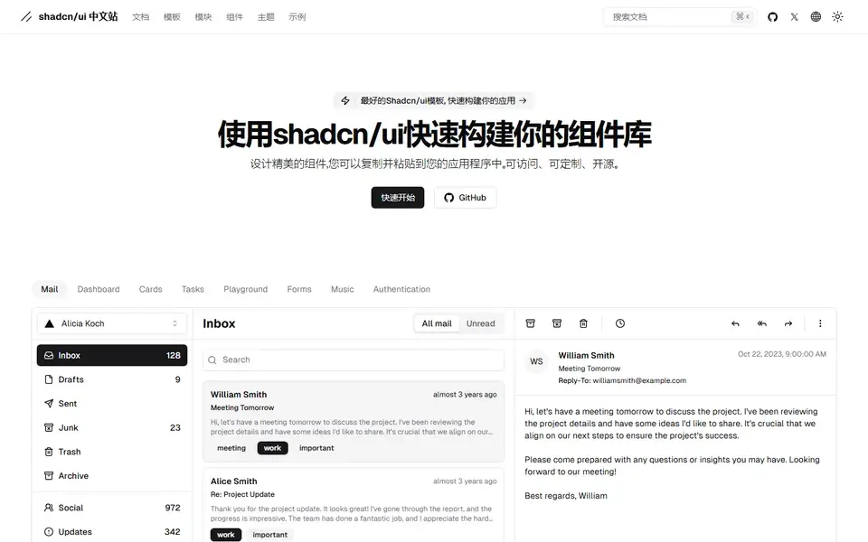
The Chinese-language home for shadcn/ui: beautifully designed, accessible, open-source components you copy and paste, plus docs, themes and templates.
 shadcn.net
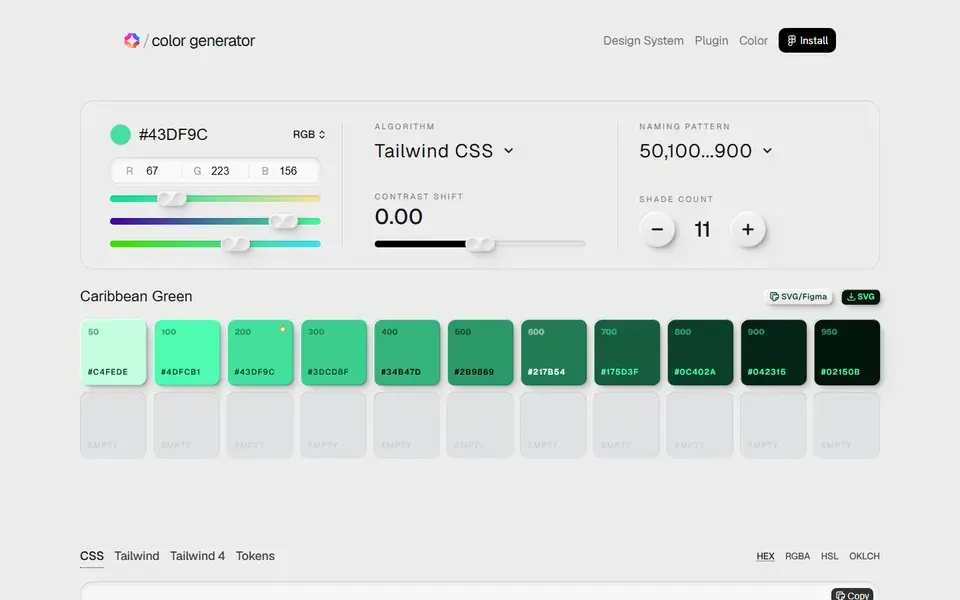
A color generator for design systems — build 50–950 shade scales with contrast control and export straight to Tailwind CSS, CSS or design tokens.
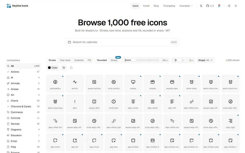
1,366 free MIT-licensed icons on one 24×24 grid, in stroke, two-tone, duotone and fill — set the exact size and stroke you ship, copy as SVG or JSX.
 keylineicons.com
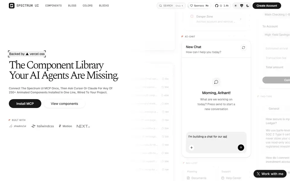
An open-source library of 250+ animation-ready React components and blocks built with Next.js, Tailwind CSS, Motion and shadcn/ui — with MCP support for AI agents.
 ui.spectrumhq.in
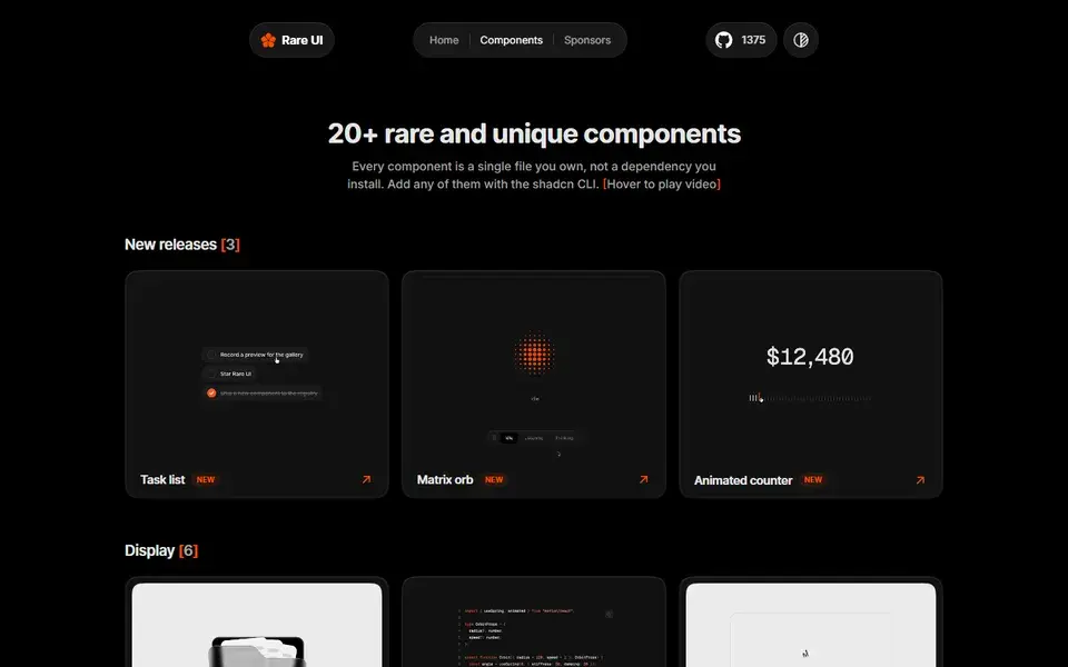
A free, open-source registry of 1,600+ rare animated React components built with Tailwind CSS and Motion, installed with the shadcn CLI or MCP.
 rareui.com
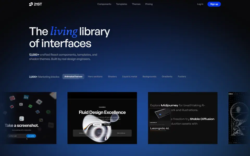
12,000+ hand-crafted React and Tailwind CSS components, templates, and shadcn themes you can preview live and install with one command.
 21st.dev
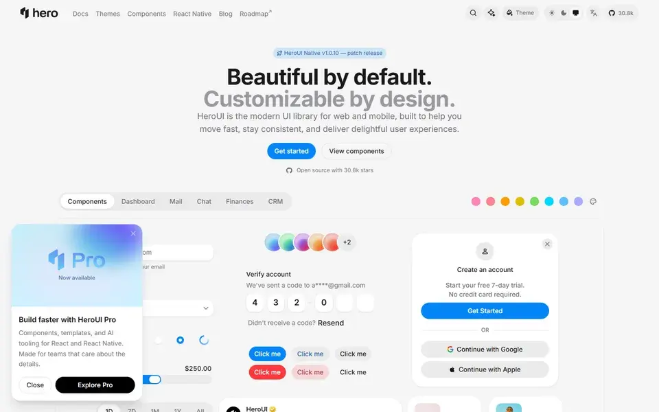
HeroUI v3 (formerly NextUI) — accessible React and React Native components built on React Aria and Tailwind CSS v4, with 27.7k GitHub stars.
 heroui.com
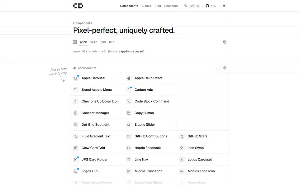
A shadcn registry of 42 pixel-perfect, uniquely crafted components — from Apple Carousel to Fluid Gradient Text — free to copy and MIT licensed.
 chanhdai.com
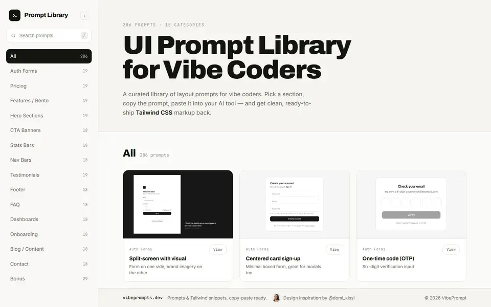
A prompt library of 286 UI layout prompts across 15 categories — paste one into your AI tool and get clean, ready-to-ship Tailwind CSS markup.
LiftKit is a design-system-derived UI framework for React and Next.js on Tailwind — currently being rewritten around Base UI primitives.
 github.com
A free UI library for React and Next.js with 200+ MIT-licensed copy-paste components, Tailwind blocks, device mockups and TypeScript source.
A React design system for dashboards and agent interfaces — 85 components, 19 chart cards, and 10 Pro templates on Tailwind CSS with editable source.
 boardui.com
The utility-first CSS framework: composable classes like flex and pt-4 build any design directly in your markup, no context switching.
 tailwindcss.com
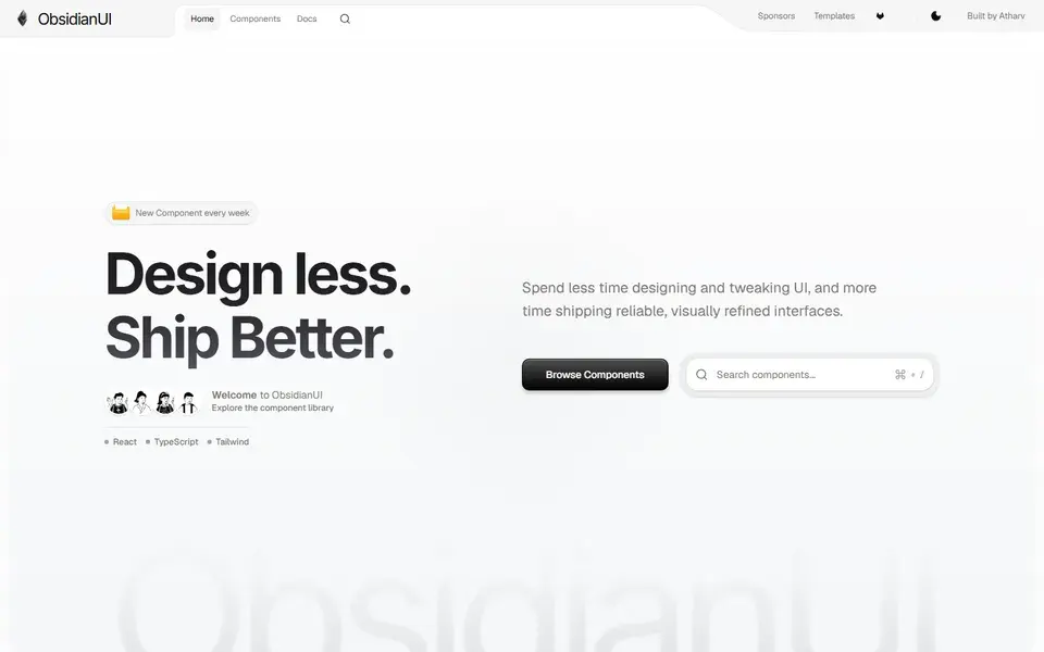
A React and Tailwind CSS component library with components, blocks and landing page templates, shipping a new signature component every week.
 obsidianui.dev
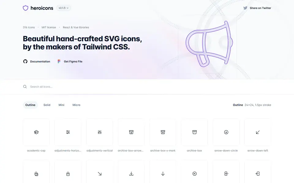
Beautiful hand-crafted SVG icons by the makers of Tailwind CSS — 316 MIT-licensed icons in outline, solid, mini and micro styles with React and Vue libraries.
 heroicons.com

A curated library of the best landing page designs on the web, searchable across 960+ sites by section, industry and color.
 landingfolio.com
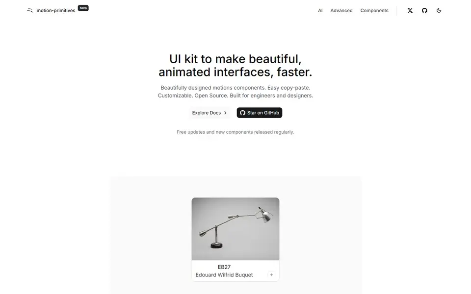
An open-source React UI kit of copy-paste animated components built for Next.js and Tailwind CSS, with new components released regularly.
 Featured
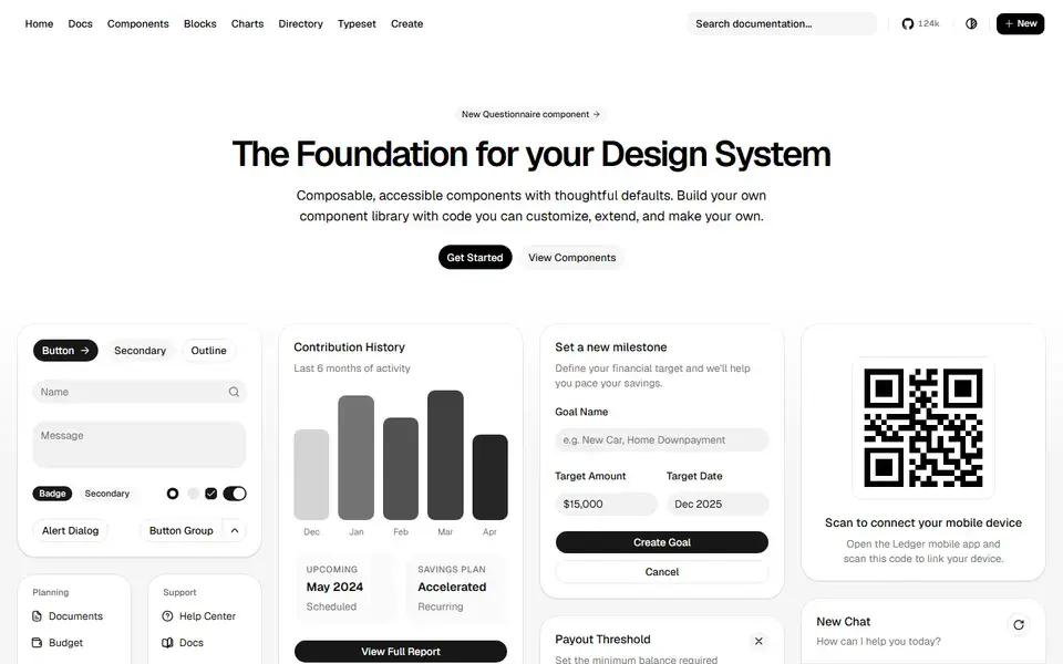
Beautifully designed components that you can copy and paste into your apps. Accessible, customizable and open source — built on Radix UI and Tailwind CSS.
 ui.shadcn.com
 Featured
150+ animated components built with React, Tailwind CSS and Motion. Copy-paste landing page sections and effects that make marketing sites stand out.
 magicui.design
 Featured
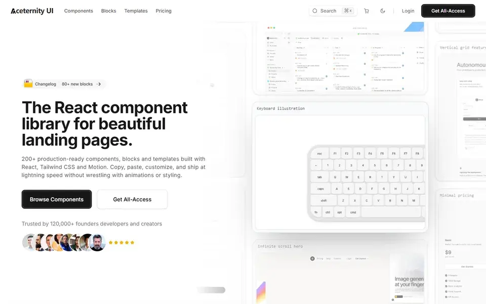
Stunning animated components and effects built with Next.js, Tailwind CSS and Framer Motion. A go-to source for hero sections with visual punch.
 ui.aceternity.com
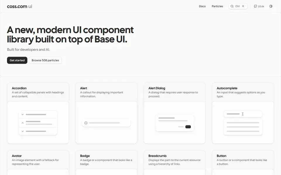
A large collection of copy-paste components built on top of shadcn/ui and Tailwind CSS — forms, layouts and application UI patterns for real products.
 Featured
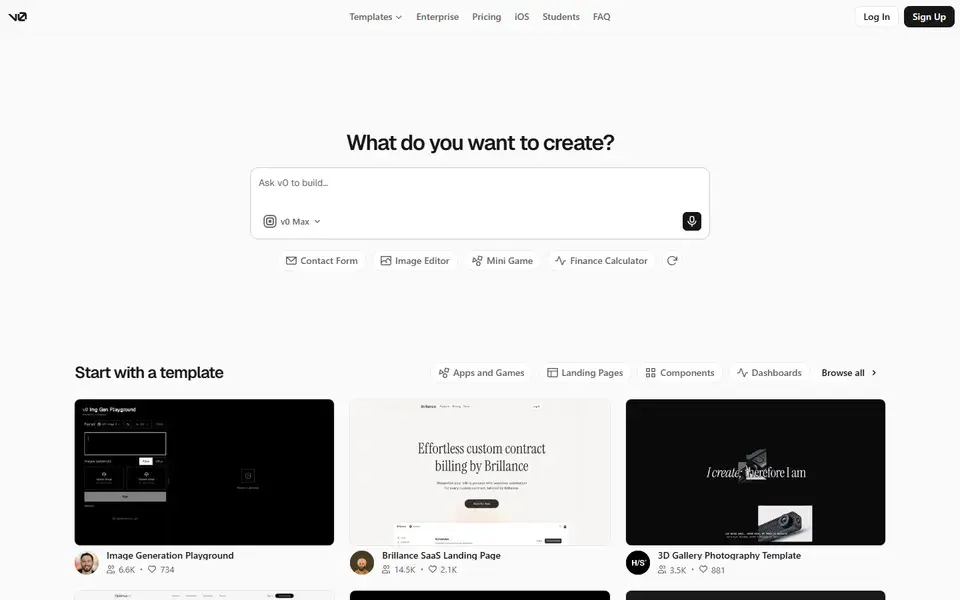
Vercel's AI-powered generative UI tool — prompt in, production-ready React and Tailwind code out. The fastest way from idea to interface.
 v0.dev
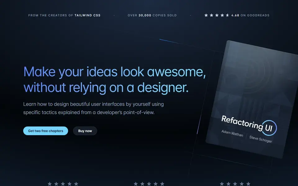
Adam Wathan and Steve Schoger's tactical guide to designing beautiful interfaces from a developer's starting point. The book behind Tailwind's design taste.
 refactoringui.com
Check whether a component set styles with Tailwind utilities directly or wraps them in its own config layer. Utility-first copies (shadcn/ui, Origin UI) restyle with classes you already know; abstraction layers can fight your tailwind.config theme. A quick test: can you change a component's spacing and color by editing classes alone?
Many Tailwind component collections assume React or Next.js; others are plain HTML with Tailwind classes. Match the dependency to your stack before copying — a React-only block drops into a Rails or Laravel project only as markup, while framework-agnostic icon sets like Heroicons work anywhere Tailwind does.
Tailwind itself is MIT, but component kits built on it range from open source to paid Pro tiers. Check the license of the actual component files (not just the site), whether a paid tier gates the components you need, and whether the project shipped updates in the last few months — orphaned component collections accumulate Tailwind upgrade debt quickly.
The framework itself — start here for utilities, the Play playground and the official showcase. The v4.x docs cover modern CSS features like oklch colors; component collections below assume you know these basics.
Animated hero sections and effects built on Next.js, Tailwind and Framer Motion, with a free core and paid Pro templates. Suited to launch pages and agency work that needs visual impact — budget for the Pro tier if you need the flagship effects.
Hundreds of copy-paste application UI patterns — forms, tables, filters — built on shadcn/ui and Tailwind conventions. A natural next layer once your product UI outgrows generic primitives; free and open source, so no licensing surprises.