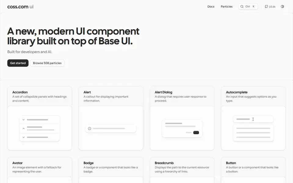
A large collection of copy-paste components built on top of shadcn/ui and Tailwind CSS — forms, layouts and application UI patterns for real products.
ReactTailwindComponents+2
originui.com
Visitopens in a new tab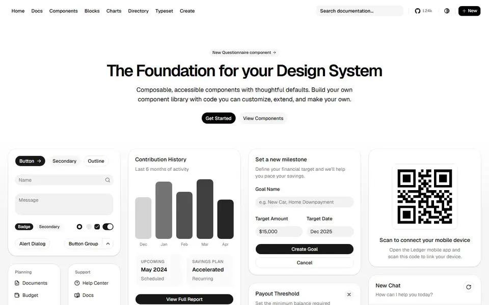

ui.shadcn.com
Beautifully designed components that you can copy and paste into your apps. Accessible, customizable and open source — built on Radix UI and Tailwind CSS.
shadcn/ui is not a traditional component package: you copy the component source into your own codebase and own every line. Built on Radix UI primitives and styled with Tailwind CSS, it has become the default starting point for modern React apps that need accessible, themeable UI without fighting someone else's design system.
A large collection of copy-paste components built on top of shadcn/ui and Tailwind CSS — forms, layouts and application UI patterns for real products.

A free, open-source React component library built on Base UI, styled with Tailwind, animated with Motion — 70+ polished components for humans and AI agents.
 appica.dev
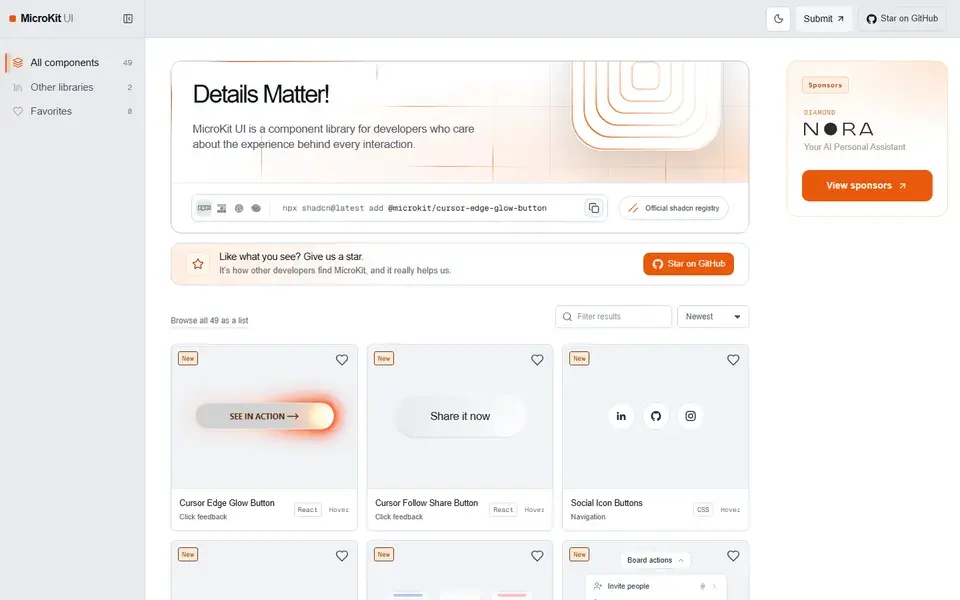
49 free copy-paste microinteractions for React, CSS and Tailwind — animated buttons, hover effects, tabs and inputs with no package to install.
 microkit.co