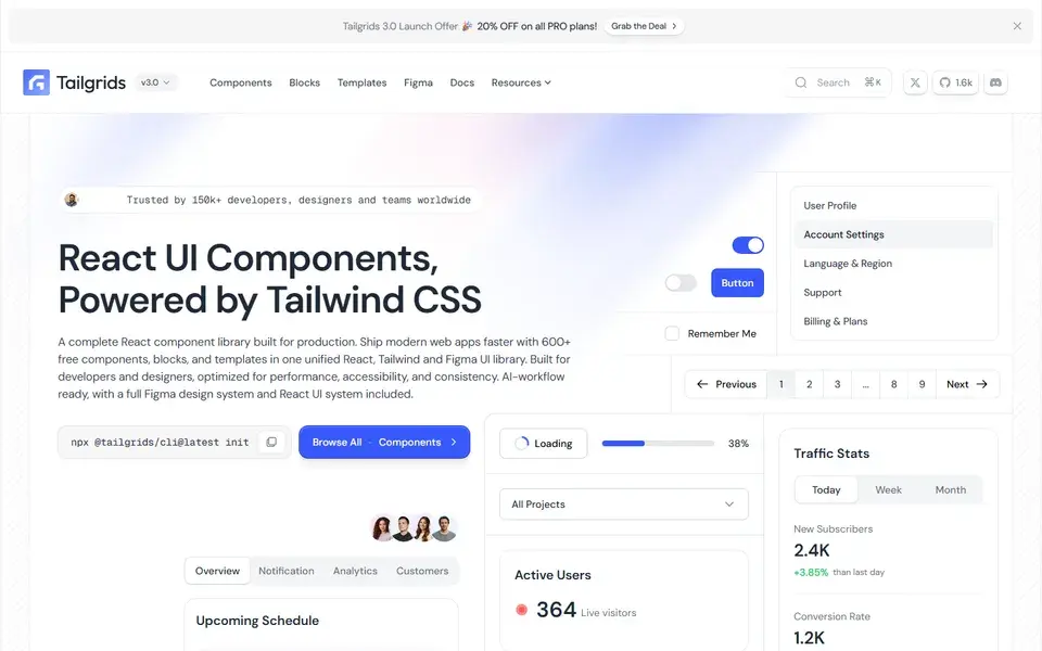
React and Tailwind CSS component library with 600+ components and blocks, a CLI, prebuilt templates and a matching Figma design system.
ReactTailwindComponents+1
 tailgrids.com
66 curated resources tagged React. Refine them with search and filters.
This page collects every resource tagged React — component libraries, animated effects, AI tools and assets. A React library decides how fast you ship and how much of the result you actually own, so use the criteria below to separate the component sets from adjacent tooling.
React and Tailwind CSS component library with 600+ components and blocks, a CLI, prebuilt templates and a matching Figma design system.
tailgrids.com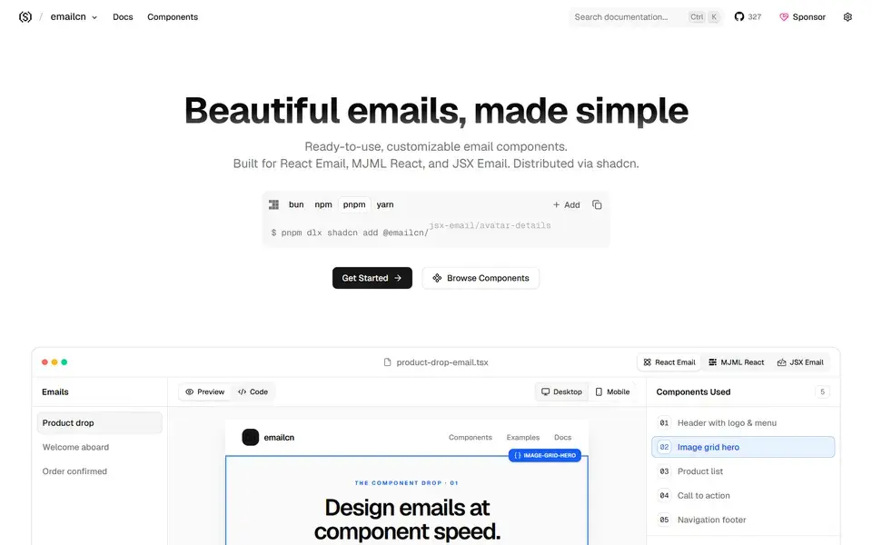
Open-source collection of beautifully designed, accessible email components for React Email, MJML React and JSX Email, copy-paste ready and compatible with shadcn/ui.
 emailcn.run
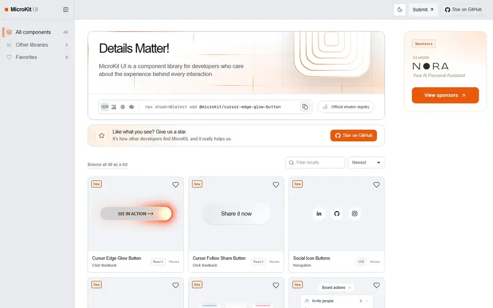
49 free copy-paste microinteractions for React, CSS and Tailwind — animated buttons, hover effects, tabs and inputs with no package to install.
 microkit.co
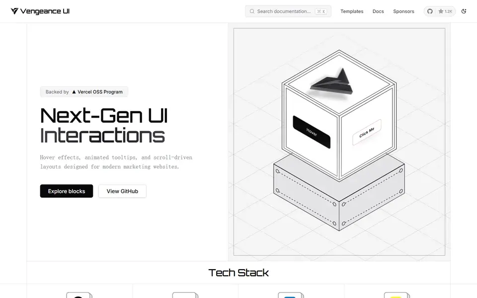
Open-source animated React components and next-gen UI interactions — displacement hovers, animated tooltips and scroll-driven cards installed via the shadcn CLI.
 vengeanceui.com
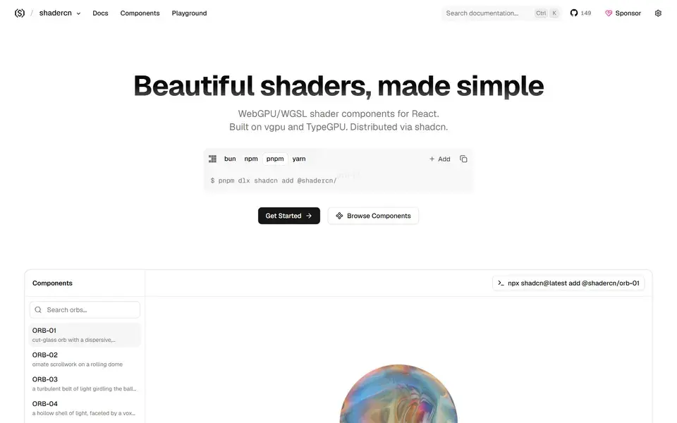
Beautifully designed, accessible and customizable shader components for React — built on vgpu and TypeGPU and made to work alongside shadcn/ui.
 shadercn.run
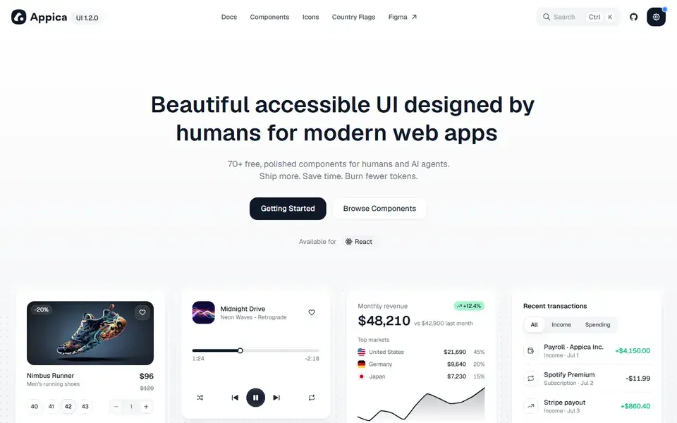
A free, open-source React component library built on Base UI, styled with Tailwind, animated with Motion — 70+ polished components for humans and AI agents.
 appica.dev
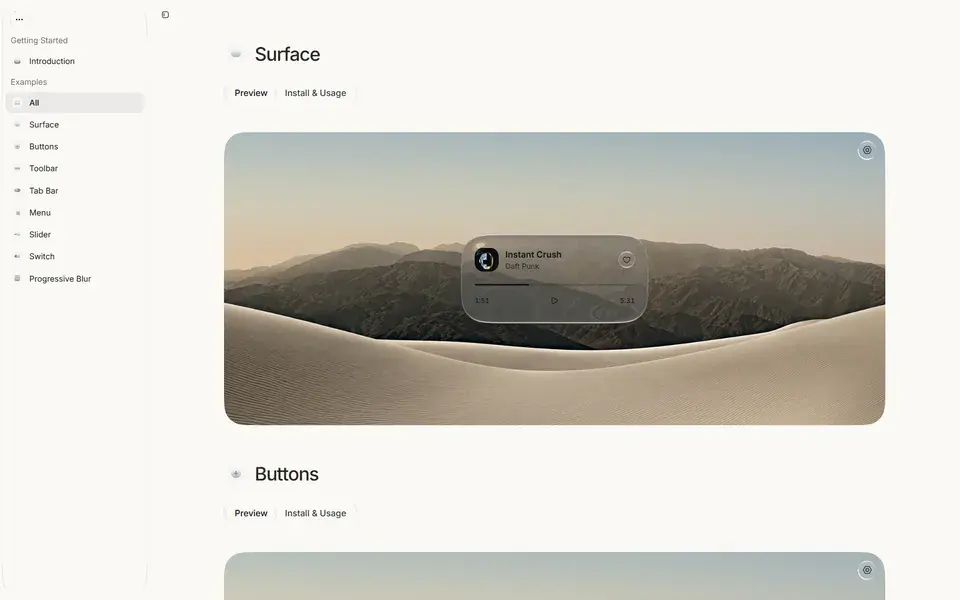
Interactive gallery of Liquid Glass materials for React, the web, and Electron, with Clear and Regular variants you can explore live.
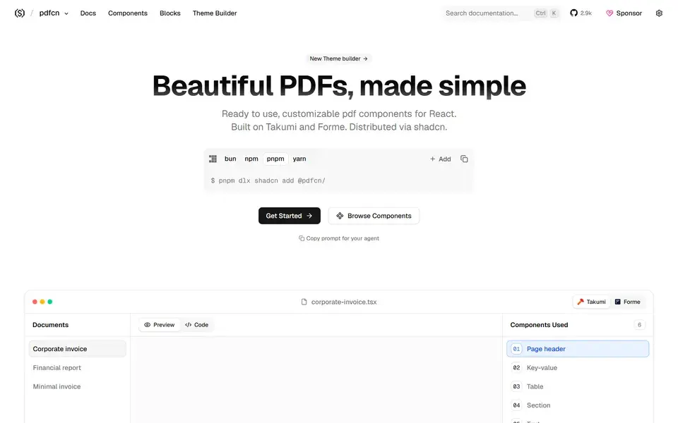
Beautifully designed, accessible and customizable PDF components — built on Takumi and Forme and made to work with shadcn/ui.
 pdfcn.dev
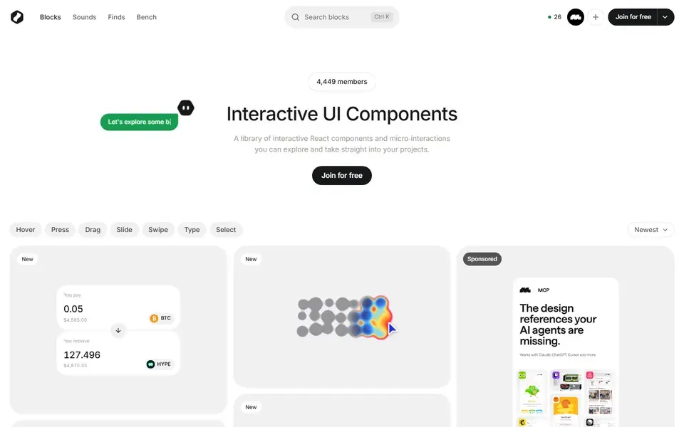
A library of interactive React UI blocks — heat maps, signature pads, drag interactions, sliders — you can explore, tweak, and take straight into projects.
 bencho.dev
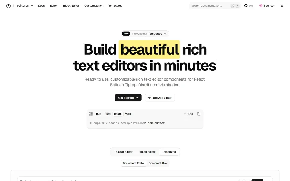
Ready-to-use, customizable rich text editor components for React, built on Tiptap and distributed via shadcn so you own the code.
 rtecn.space
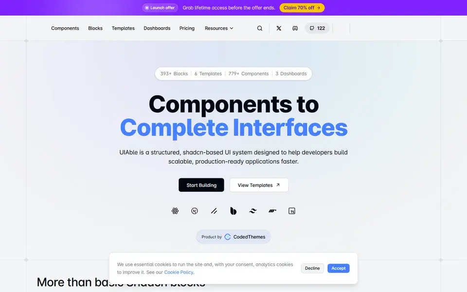
A complete Shadcn design system with reusable components, blocks, templates and dashboards you copy, customize and ship faster.
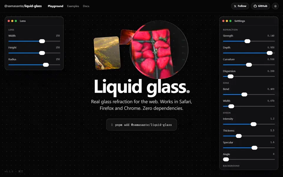
A headless React lens that recreates Apple's Liquid Glass on the web — real refraction of the live DOM in Safari, Firefox and Chrome, with zero dependencies.

Agent-ready React components, screens, and blocks for AI products and SaaS — one dependency-free file each, added by hand or by Claude, Cursor, or v0.
 affectui.com
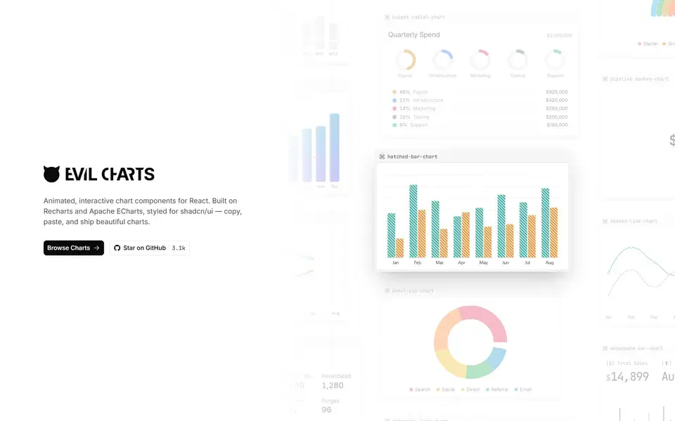
Free, open-source animated React chart components built on Recharts and Apache ECharts, styled for shadcn/ui — copy, paste and ship.
 evilcharts.com
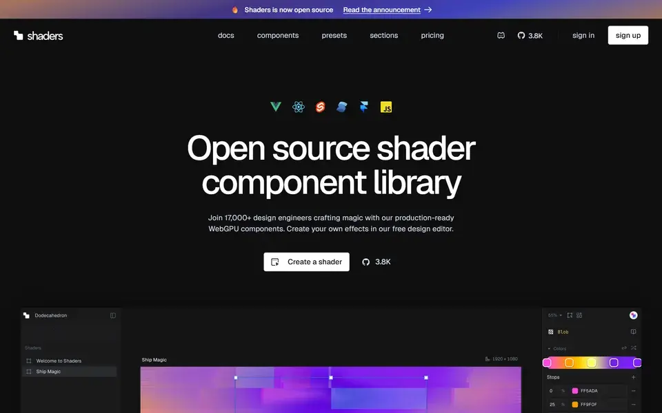
Open-source WebGPU shader components for React, Vue, Svelte, Solid and JS — declarative animated backgrounds, overlays and interactive effects.
 shaders.com
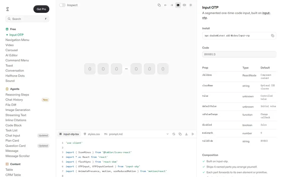
Polished, copy-paste React components built with Tailwind CSS — every state designed, in light and dark, with AI-ready prompt files included.
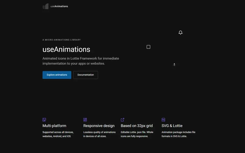
Free MIT-licensed library of 298 handcrafted animated icons built with Lottie, optimized for a 32px grid and usable on web, React, iOS and Android.
 useanimations.com
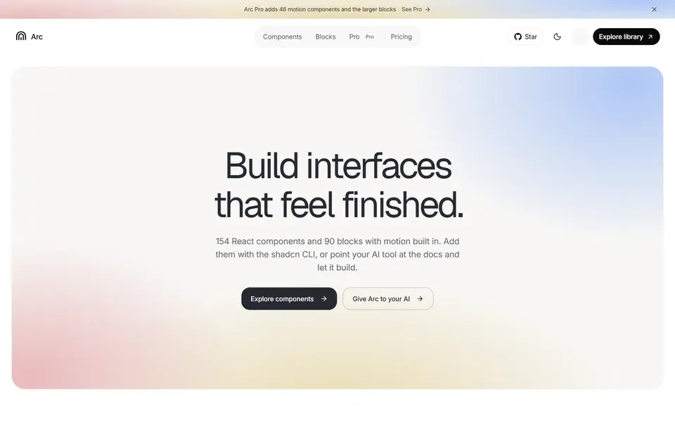
154 React components and 90 blocks with motion built in, installed as editable source via the shadcn CLI for shadcn/ui and Next.js projects.
 uiarc.dev
Polished React motion components you can copy with live previews, source code, dependencies and shadcn registry commands.
 skecher-ui.com
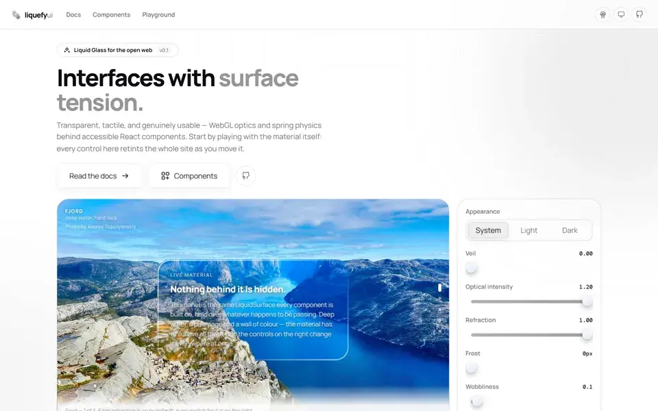
Open-source Liquid Glass components for React with real WebGL edge refraction, spring physics, and accessible primitives — shipped as a shadcn registry plus an MCP server.
 liquefy-ui.com
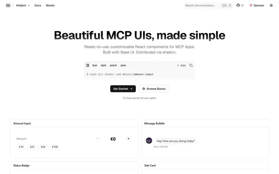
Beautifully designed, accessible MCP App UI components built with Base UI, copy-paste installable and compatible with shadcn/ui.
 mcpcn.dev
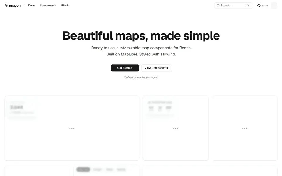
Free, open-source, customizable map components for React built on MapLibre GL, styled with Tailwind CSS and following the shadcn/ui pattern.
 mapcn.dev
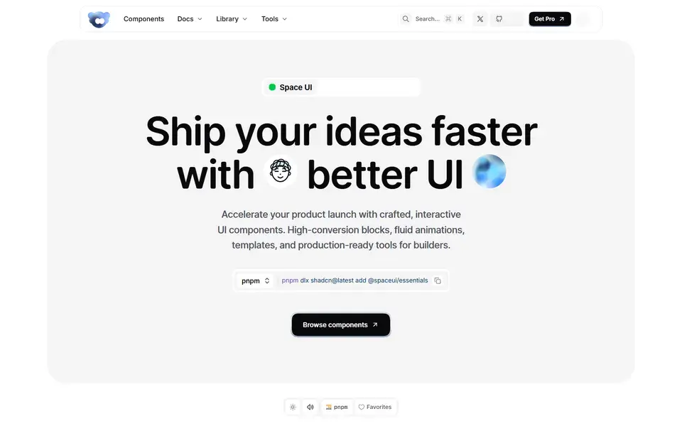
Open-source library of interactive React components, blocks, shaders and hooks built with Base UI, Tailwind CSS and Motion, distributed via a shadcn registry.
 spaceui.one
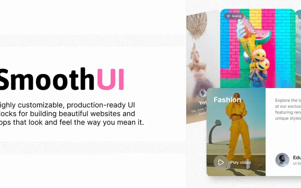
198 free, MIT-licensed animated React components with smooth Motion animations — drop-in shadcn/ui compatible and fully customizable with Tailwind CSS.
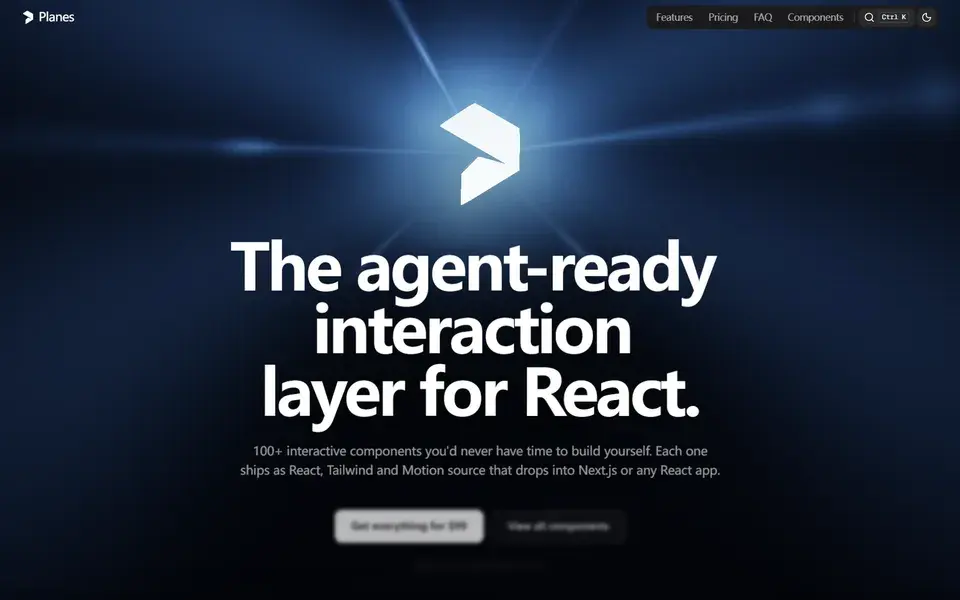
A shadcn-style registry of 131 polished, animated React components — from command palettes to WebGL heroes — installed as owned .tsx source files.
 useplanes.com
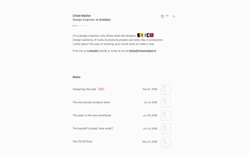
Portfolio of Chloé Maillot, a Paris-based design engineer at Artefact who ships what she designs — design systems, AI tools and production products.
 chloemaillot.fr
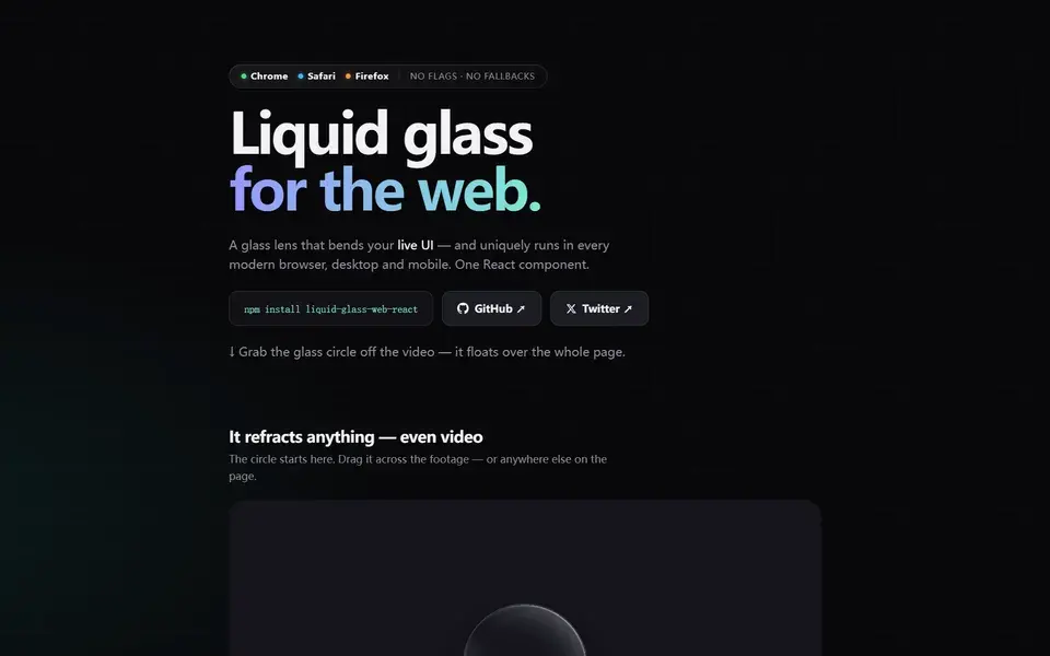
MIT-licensed React component rendering Apple-style liquid glass lenses that refract live DOM — cross-browser SVG displacement, ~5 kB, zero dependencies.
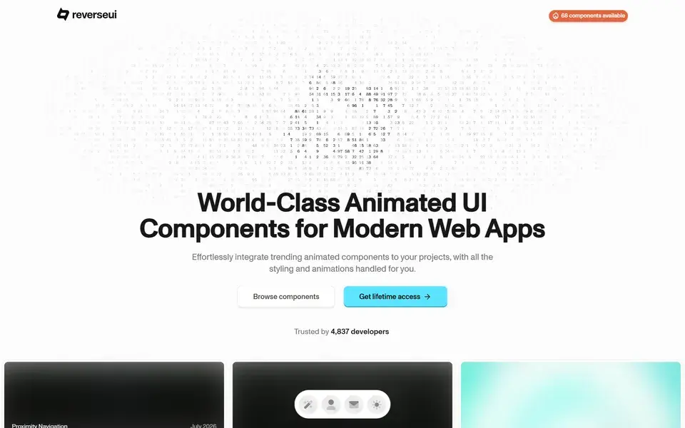
A premium collection of 50+ customizable, ready-to-use animated UI components for modern web apps — easy to integrate and fully styled.
 reverseui.com
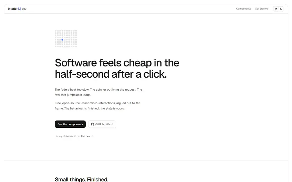
Free, open-source React micro-interaction components for the half-second after a click — copy the TypeScript source; the behavior is finished, the style is yours.
 interior.dev
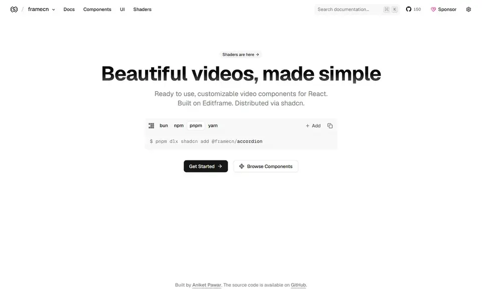
Beautifully designed, customizable video components for React, built on Editframe and copy-paste installable alongside shadcn/ui.
 framecn.dev
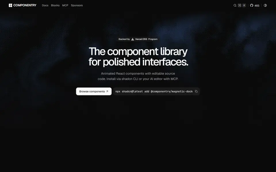
Beautiful, animated React UI components with styling and motion already handled — built with Tailwind CSS, TypeScript and Framer Motion.
 componentry.dev
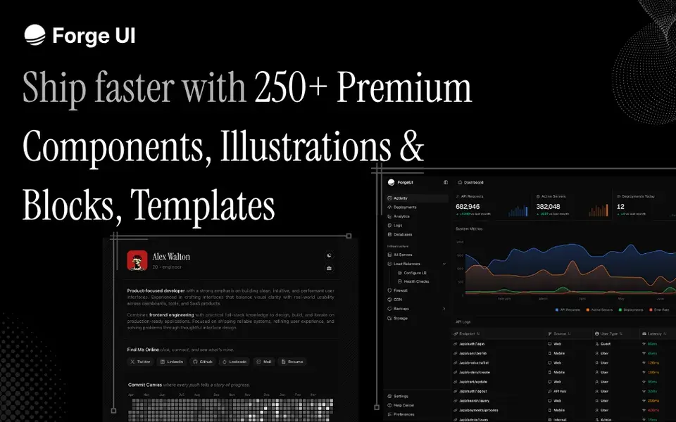
React and Tailwind UI library with animated components, marketing blocks, illustrations and copy-paste templates — shadcn-compatible, with free and Pro tiers.
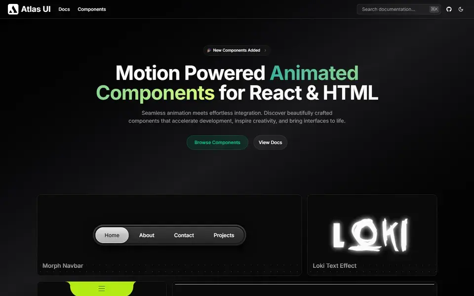
Open-source, motion-powered animated components for React and HTML — beautifully crafted pieces that bring interfaces to life with seamless animations.
 atlasui.dev

Open-source React and React Native components crafted with Tailwind CSS and NativeWind — one copy-paste library shared across web, Next.js and Expo apps.
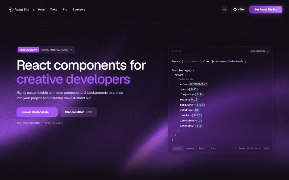
An open source collection of 200+ high-quality, animated, interactive and fully customizable React components and micro-interactions.
 reactbits.dev
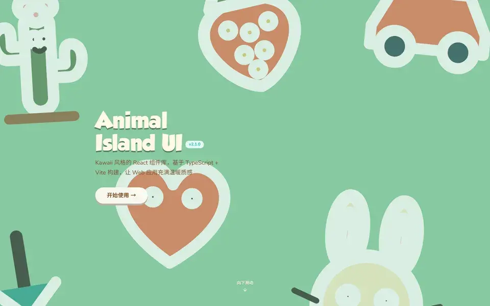
A cozy React + TypeScript component library with an original island-style design language, where every visual, icon and animation is crafted from scratch.
 guokaigdg.github.io
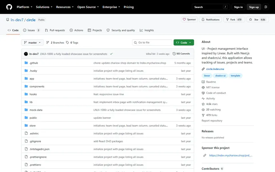
A Linear-inspired project management interface built with Next.js, shadcn/ui and Tailwind CSS for tracking issues, projects and teams.
 github.com
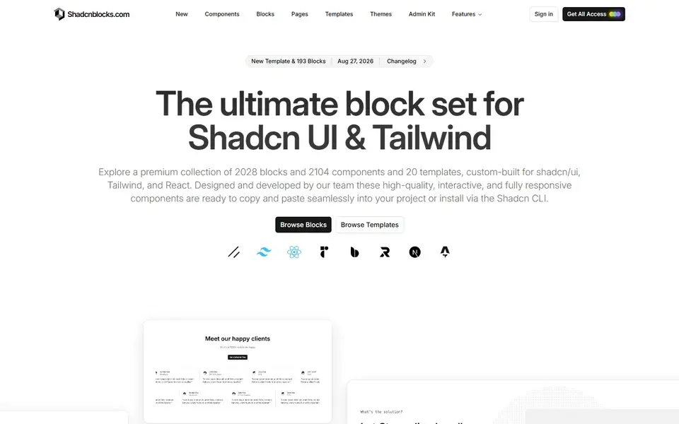
A premium set of 2,150+ extra blocks, 2,151 components and 21 templates for shadcn/ui, Tailwind and React — copy-paste or install via the shadcn CLI.
 shadcnblocks.com
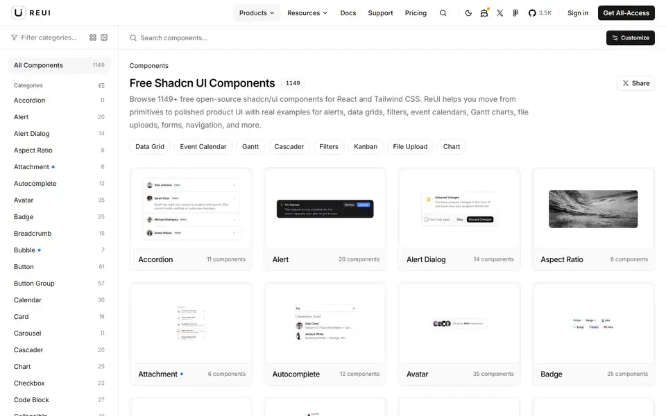
1,000+ free, open-source shadcn/ui components and React examples for Tailwind CSS, from data grids and Gantt charts to kanban boards and file uploads.
 reui.io
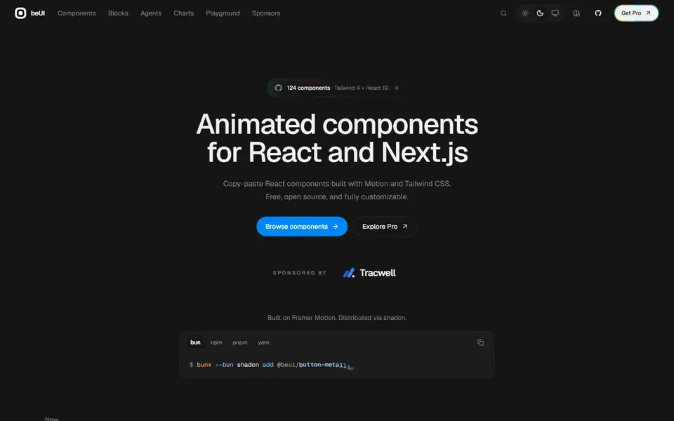
138 free, open-source animated components for React and Next.js, built with Motion and Tailwind CSS — copy the source or install via the shadcn CLI.
 beui.dev
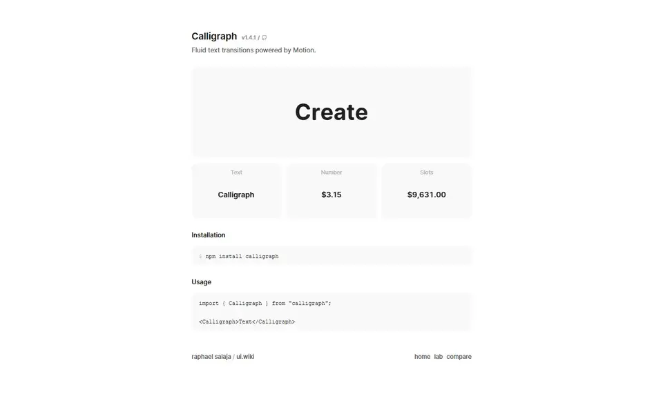
Calligraph is a React component for fluid, per-character text transitions powered by Motion, with text, number and slot-machine variants.
 calligraph.raphaelsalaja.com
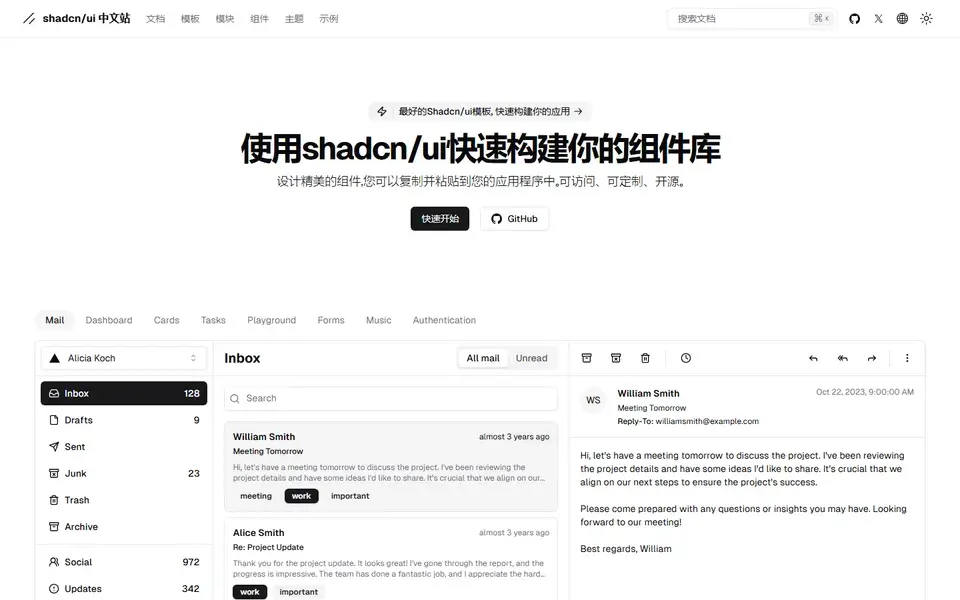
The Chinese-language home for shadcn/ui: beautifully designed, accessible, open-source components you copy and paste, plus docs, themes and templates.
 shadcn.net

An open-source library of 250+ animation-ready React components and blocks built with Next.js, Tailwind CSS, Motion and shadcn/ui — with MCP support for AI agents.
 ui.spectrumhq.in
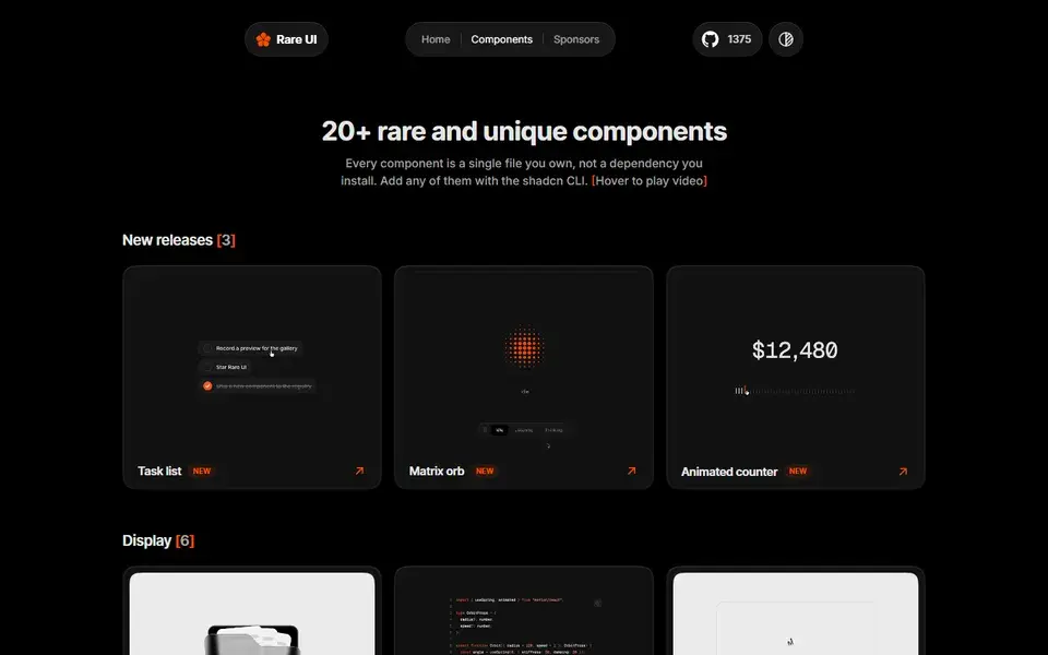
A free, open-source registry of 1,600+ rare animated React components built with Tailwind CSS and Motion, installed with the shadcn CLI or MCP.
 rareui.com

Beautifully designed, copy-paste UI components for AI agent conversations — thinking states, tool calls, streaming text, citations — in React, Vue, and Svelte.
 aicss.dev
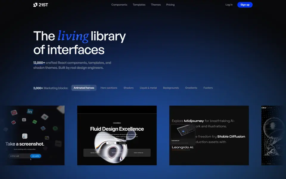
12,000+ hand-crafted React and Tailwind CSS components, templates, and shadcn themes you can preview live and install with one command.
 21st.dev
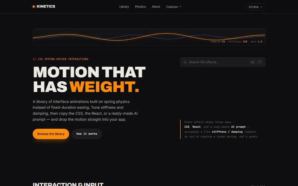
Kinetics is a library of 153 spring-driven micro-interactions — tune the physics, then copy the CSS, the React, or an AI prompt.
 kinetics.colorion.co
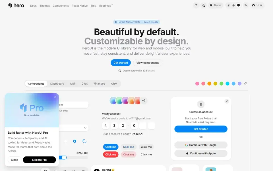
HeroUI v3 (formerly NextUI) — accessible React and React Native components built on React Aria and Tailwind CSS v4, with 27.7k GitHub stars.
 heroui.com
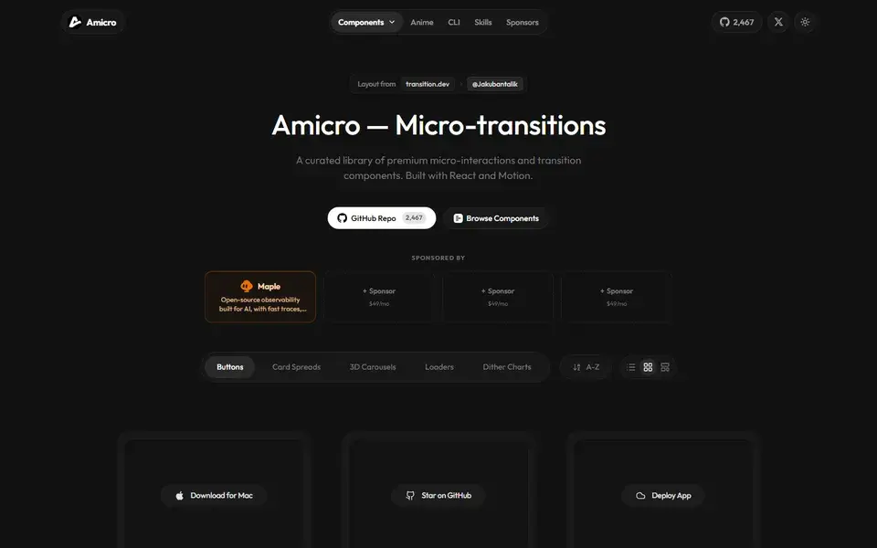
160+ copy-paste React components for motion, transitions and UI effects — morphing buttons, 3D carousels, loaders and chart animations.
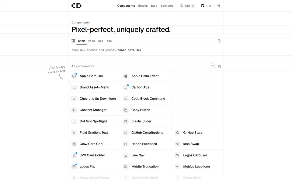
A shadcn registry of 42 pixel-perfect, uniquely crafted components — from Apple Carousel to Fluid Gradient Text — free to copy and MIT licensed.
 chanhdai.com
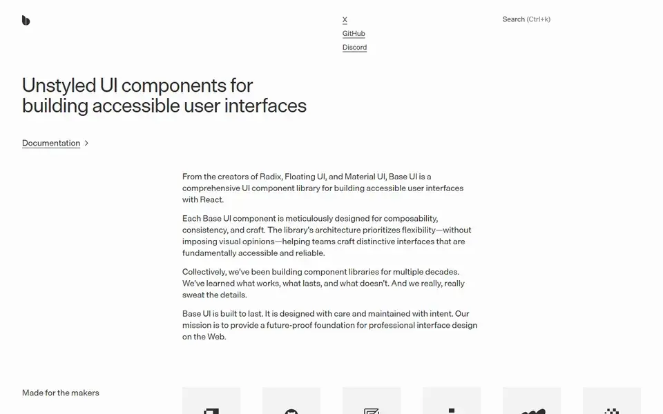
Unstyled React UI components for building accessible web apps and design systems, from the creators of Radix, Floating UI, and Material UI.
 base-ui.com
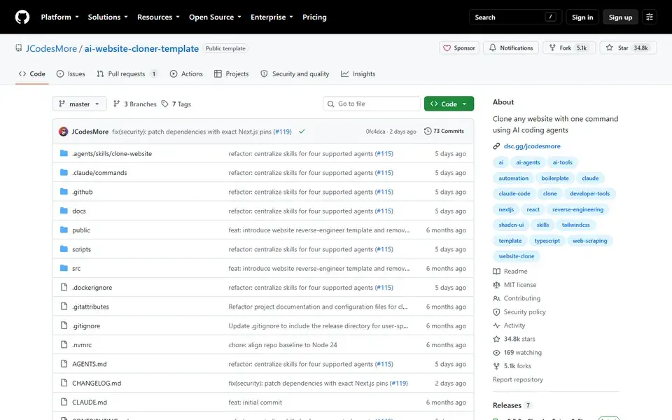
A GitHub template that turns a URL into a clean Next.js clone — give your AI coding agent one command and it recreates the site.
 github.com
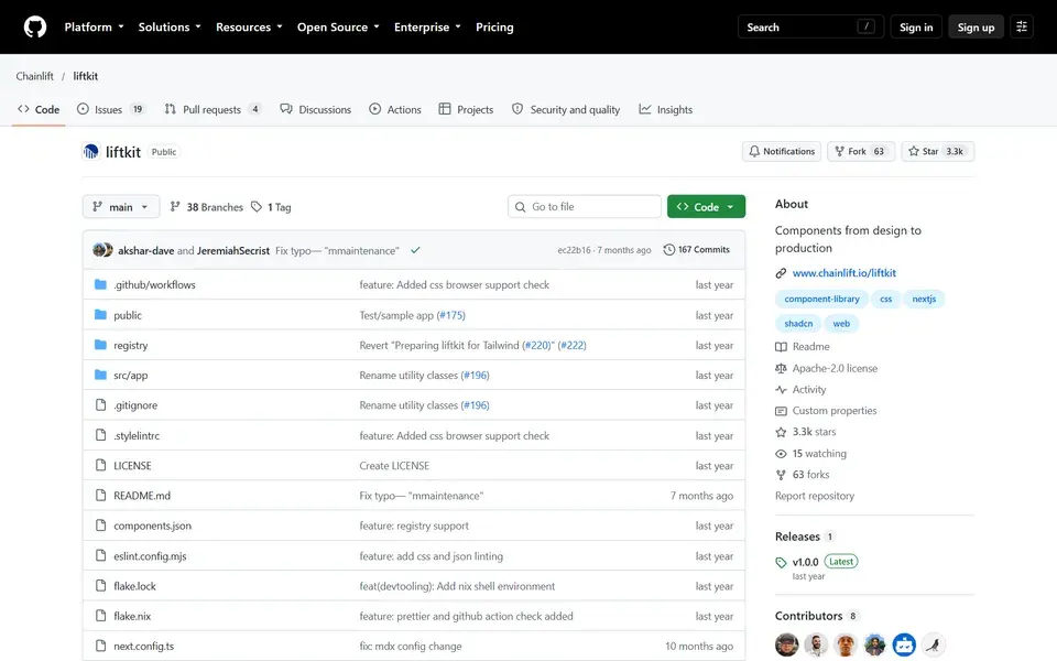
LiftKit is a design-system-derived UI framework for React and Next.js on Tailwind — currently being rewritten around Base UI primitives.
 github.com
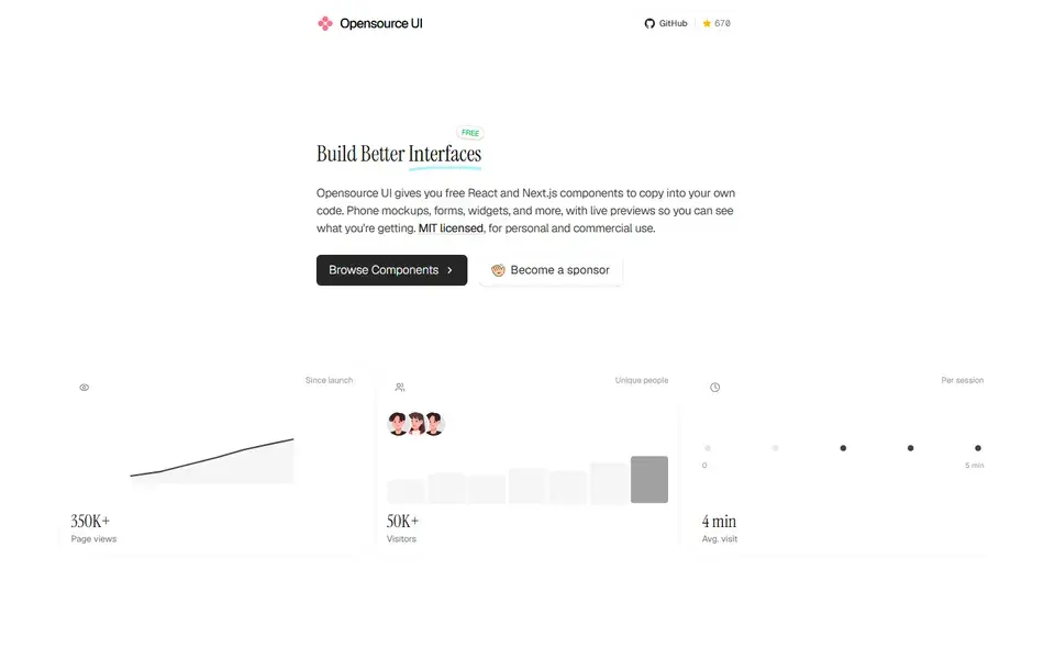
A free UI library for React and Next.js with 200+ MIT-licensed copy-paste components, Tailwind blocks, device mockups and TypeScript source.
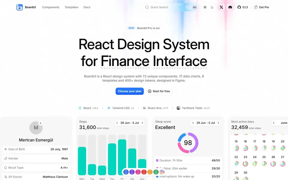
A React design system for dashboards and agent interfaces — 85 components, 19 chart cards, and 10 Pro templates on Tailwind CSS with editable source.
 boardui.com
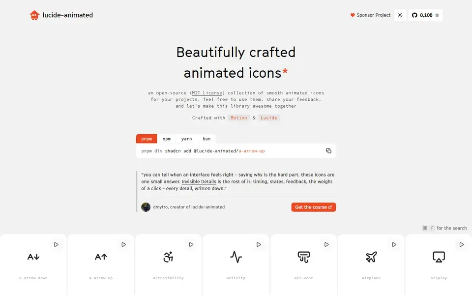
A free, MIT-licensed set of 350+ animated React icons built on Lucide and Motion, installable through the shadcn CLI registry.
 lucide-animated.com
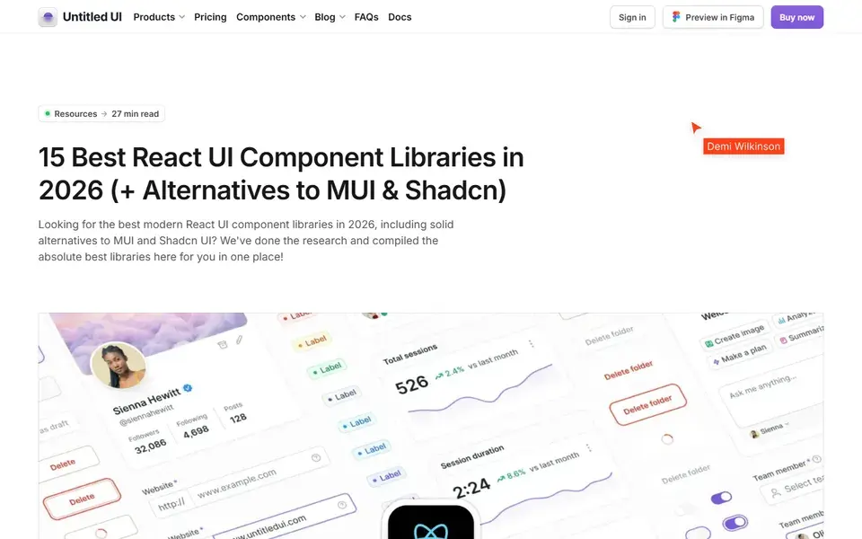
Untitled UI's 2026 guide to 15 React UI component libraries, comparing MUI, shadcn/ui, AlignUI, Ant Design and more on depth and price.
 untitledui.com

Home of five free React UI effect libraries — Beam, Orb, Gooey, Metal and Image — built to be installed and wired up by coding agents.
 libraries.dev
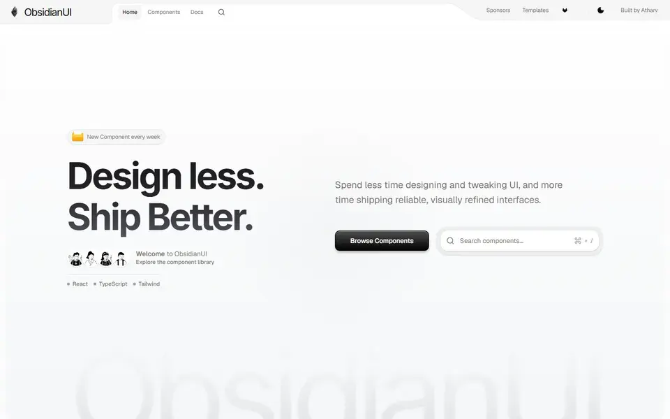
A React and Tailwind CSS component library with components, blocks and landing page templates, shipping a new signature component every week.
 obsidianui.dev
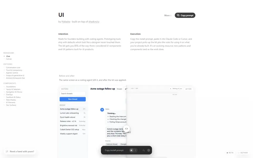
A single-file React UI kit for AI products, built on shadcn/ui — screens, AI UX patterns and components for founders building with coding agents.
 ui.halaska.com
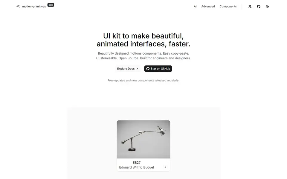
An open-source React UI kit of copy-paste animated components built for Next.js and Tailwind CSS, with new components released regularly.
 Featured
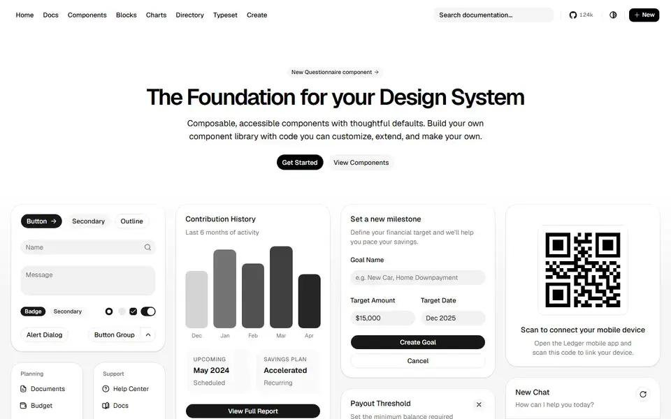
Beautifully designed components that you can copy and paste into your apps. Accessible, customizable and open source — built on Radix UI and Tailwind CSS.
 ui.shadcn.com
 Featured
150+ animated components built with React, Tailwind CSS and Motion. Copy-paste landing page sections and effects that make marketing sites stand out.
 magicui.design
 Featured
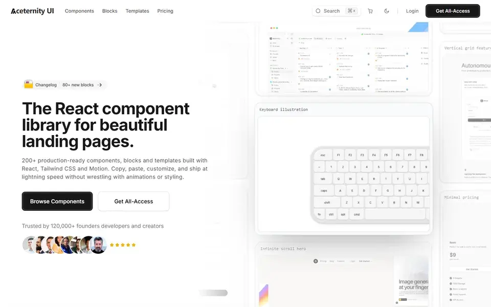
Stunning animated components and effects built with Next.js, Tailwind CSS and Framer Motion. A go-to source for hero sections with visual punch.
 ui.aceternity.com
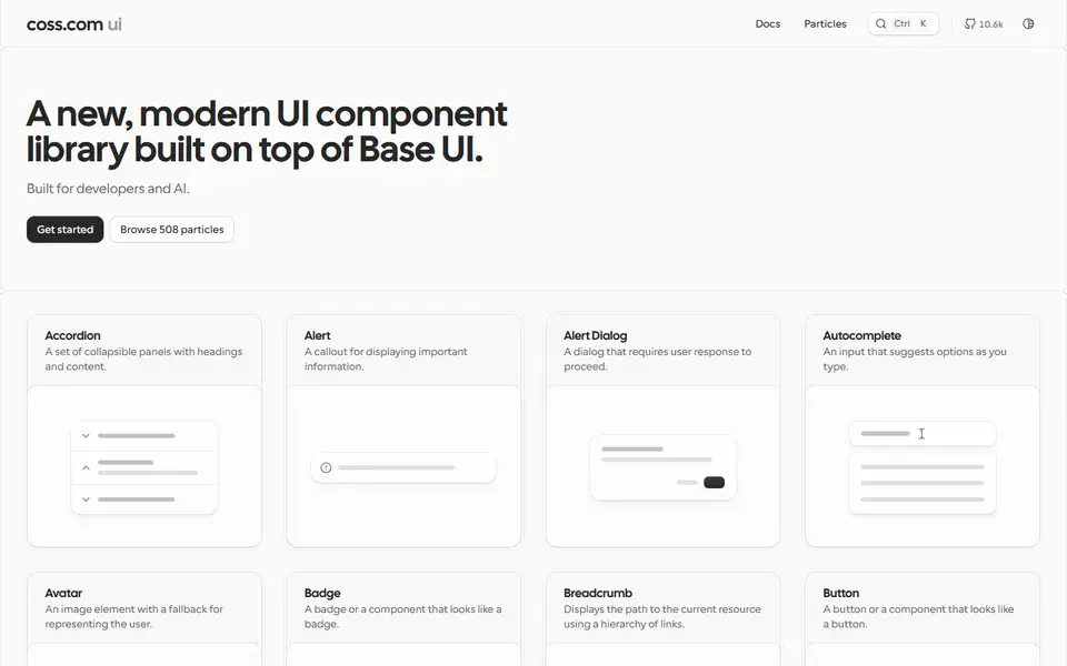
A large collection of copy-paste components built on top of shadcn/ui and Tailwind CSS — forms, layouts and application UI patterns for real products.
 Featured
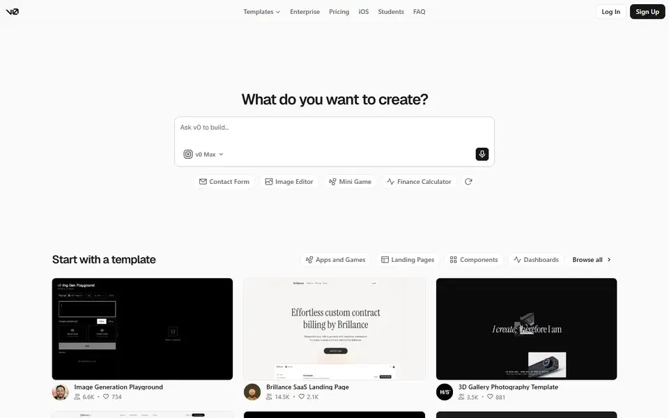
Vercel's AI-powered generative UI tool — prompt in, production-ready React and Tailwind code out. The fastest way from idea to interface.
 v0.dev
Check which React version and meta-framework the library targets before adopting it. Components built for Next.js app-router server components behave differently from client-only Vite apps, and React Native support (as in Gluestack) is a separate ecosystem entirely. The quickest check: does the library document a Next.js or Vite install path, and does its demo run in your setup?
Copy-paste libraries (shadcn/ui style) put the component source in your repo, so you can restyle or rip out any part — at the cost of merging upstream improvements yourself. Installed npm packages update centrally but style from the outside in. Decide early which trade-off fits your team: source ownership for design-system work, package installs for speed.
Open the live demo with a keyboard and a screen reader before committing: tab through menus, focus a modal, check that focus traps return correctly. Libraries built on Radix UI or Base UI primitives inherit tested accessibility; purely decorative animation libraries often do not, which matters most for the components users interact with daily.
The copy-paste baseline for modern React apps: Radix UI primitives with Tailwind styling, so you own every line. Best when you want accessible components your team can retheme freely — expect to maintain the copied source yourself.
200+ animated React components and micro-interactions for interfaces that need memorable motion. Copy-paste and customizable, so it layers on top of an existing design system rather than replacing it — check animation cost on low-power devices.
Animated sections and effects built with Tailwind CSS and Motion, aimed at marketing sites and SaaS landing pages. Strongest fit when the goal is a premium first impression; pair it with a structural library like shadcn/ui for day-to-day app UI.